
HU University of Applied Sciences / SHL
由专筑网小R,吴静雅编译
来自建筑事务所的描述:荷兰乌德勒支应用科学大学(HU University of Applied Sciences)成立于1995年,当时几个独立的教育机构进行了合并。直到四年前,学校还分布在乌德勒支的 30多座建筑中。该学校优先考虑将各个功能整合到乌德勒支科学园区的5座相邻的建筑之中,而这座由Schmidt Hammer Lassen Architects事务所设计的大楼是最后一个完工项目。建筑面积22310平方米的Heidelberglaan15号楼是经济、管理、信息交流、技术、媒体和通信等八个学院的所在地。
Text description provided by the architects. Until four years ago, the HU University of Applied Sciences, a school founded in 1995 through the merger of several previously independent institutions, was spread across some 30 buildings in Utrecht, The Netherlands. The university prioritized consolidating its footprint into five adjacent buildings on its Utrecht Science Park campus, and Schmidt Hammer Lassen Architects’ new structure is the last of the five to be completed. The 22,310-square-metre Heidelberglaan 15 building is home to eight educational institutes in the economics, management, information communication and technology, and media and communication sectors.

Schmidt Hammer Lassen建筑事务所的设计主管与负责人Kristian Ahlmark说:“应用科学大学面向5800名学生,占地面积3000平方米,每天都有工作人员与参观者在此穿梭,因此这是个巨大的空间设计挑战。”
“The HU University of Applied Sciences was a spatial design challenge with more than 5,800 students, faculty and visitors moving through the 3,000-square-metre footprint of the building daily,” said Kristian Ahlmark, Partner and Design Director Copenhagen at Schmidt Hammer Lassen.
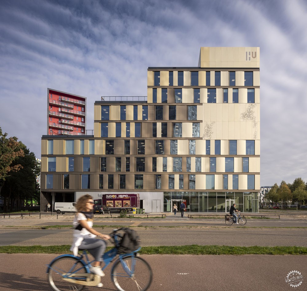
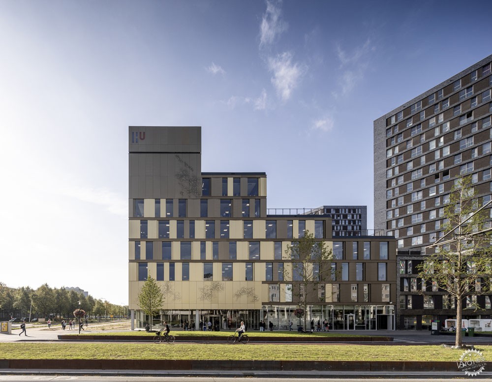
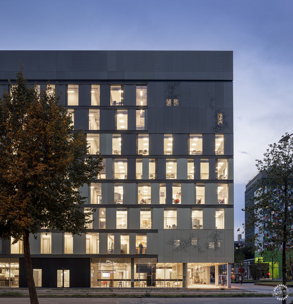
在Bolognalaan大道的一侧,布置有两间90座报告厅、一间媒体学校专业的电视演播室、一间会议中心,该会议中心有着坚实的表面覆层。
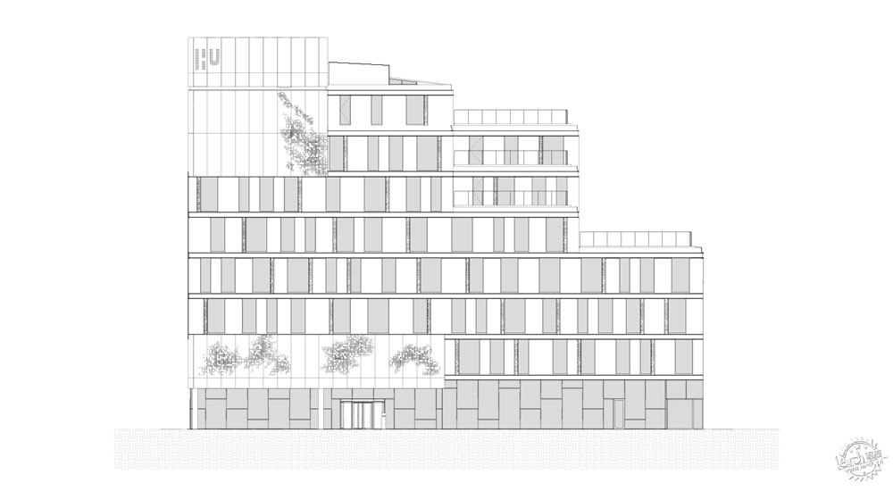
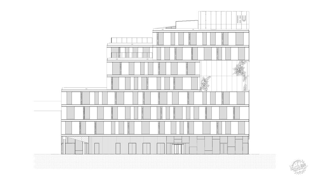
When viewing the building from Bolognalaan street that runs along the east side of the building, two 90-seat lecture halls, an advanced television studio for the media school, and a meeting center can be identified by the solid patches of the cladding.
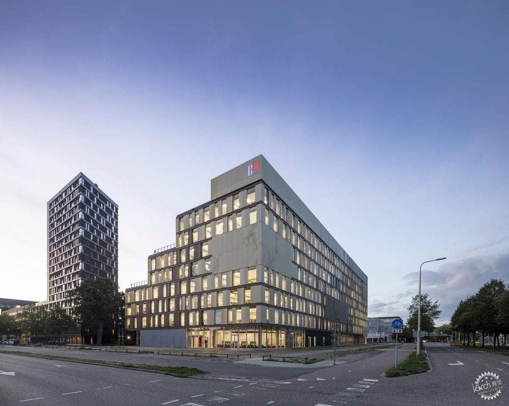
在建筑的另一侧是朝向学生宿舍的内置院落。建筑体量面向东侧立面逐步上升,与现有建筑保持联系,让周围空间焕发活力。
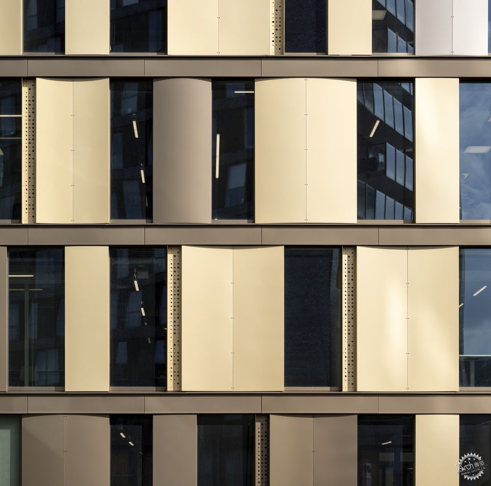
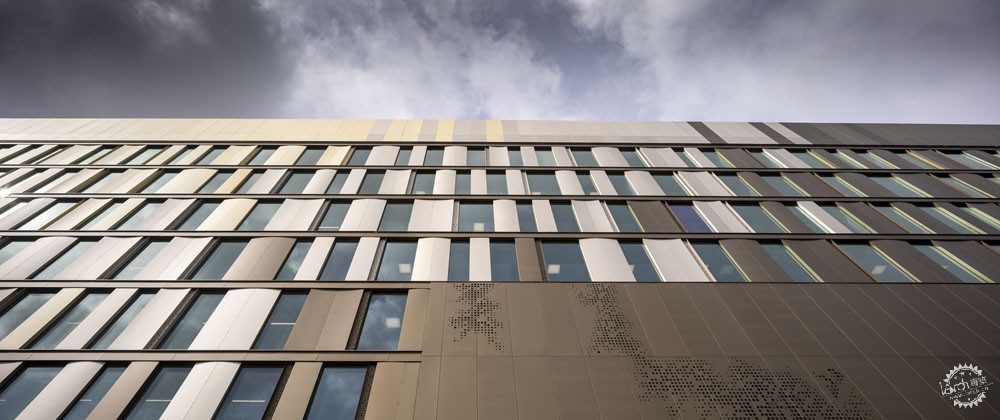
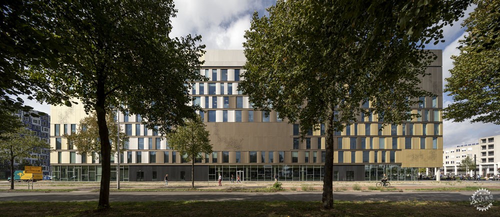
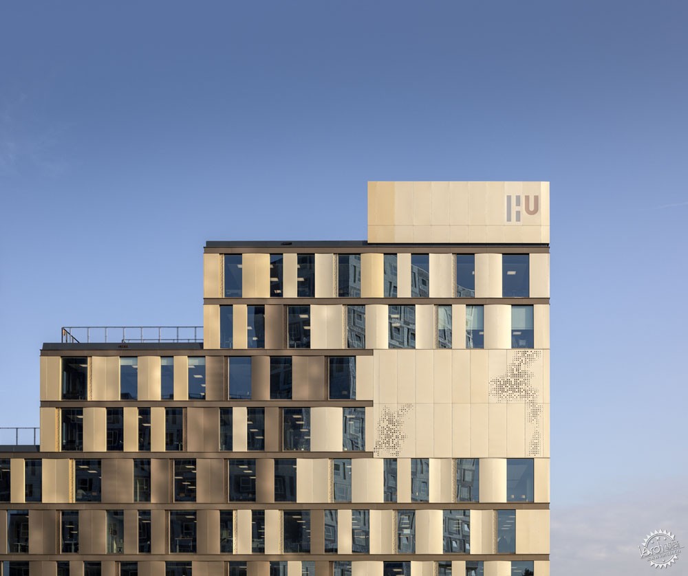
建筑的外立面创意地表达了色彩,建筑师应用了中性色调的阳极氧化铝覆层,颜色按照层次逐步过渡,构成温和的渐变效果。
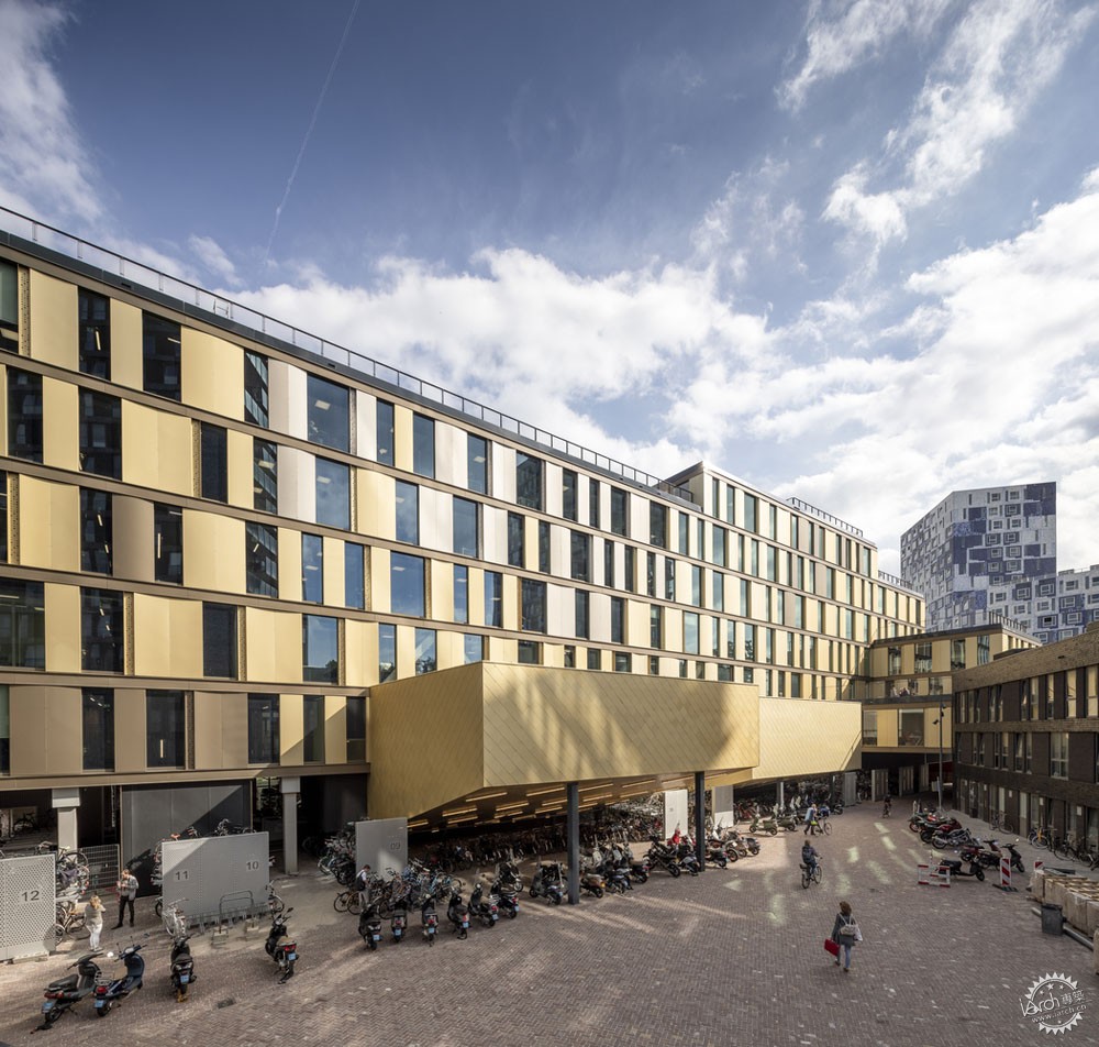
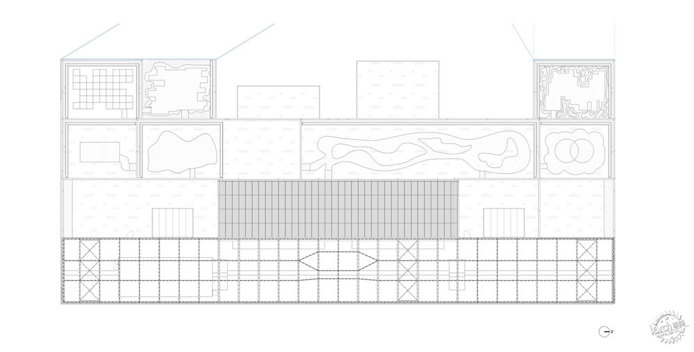
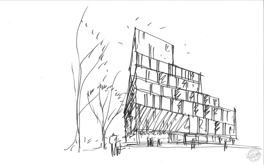
On the opposite side of the building, a new inner courtyard is created towards the neighboring student housing block. The volume steps up towards the east façade allowing it to connect with the existing buildings and activating it from all sides.
Creative use of color is demonstrated on the exterior façade that features neutrally-colored anodized aluminum cladding, with one color dissolving into the next to create a gentle patchwork effect.
多种色彩的渐变表达了内部布局的交织设计,说明了学校的8个学院结合于建筑之中。
The various colors that fade into each other represent the interwoven design of the interior layout that allows users of the school’s eight institutes to intersect within the building.

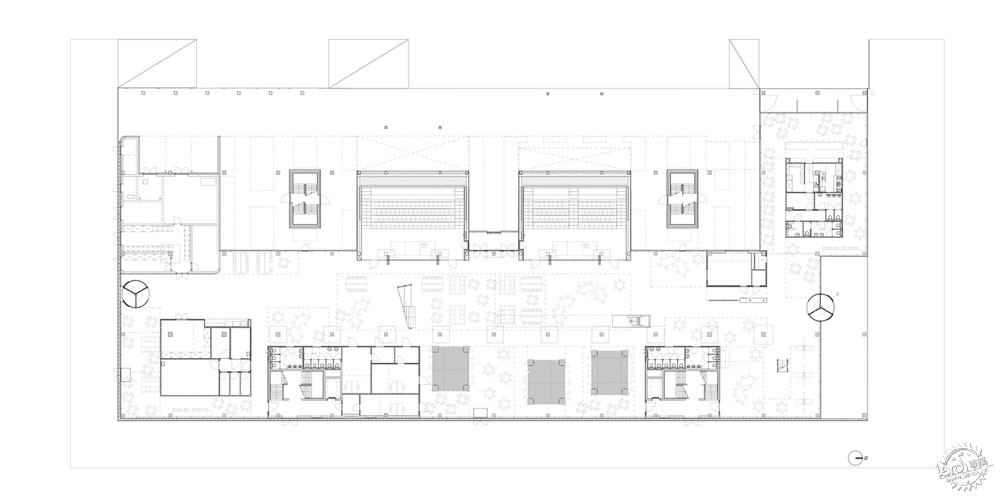
两间位于地面层的大型报告厅从立面延伸向院落,其下方是自行车停车场。
The two large, ground floor lecture halls jut out from the façade into the courtyard and serve as shelter for bicycle parking beneath them.

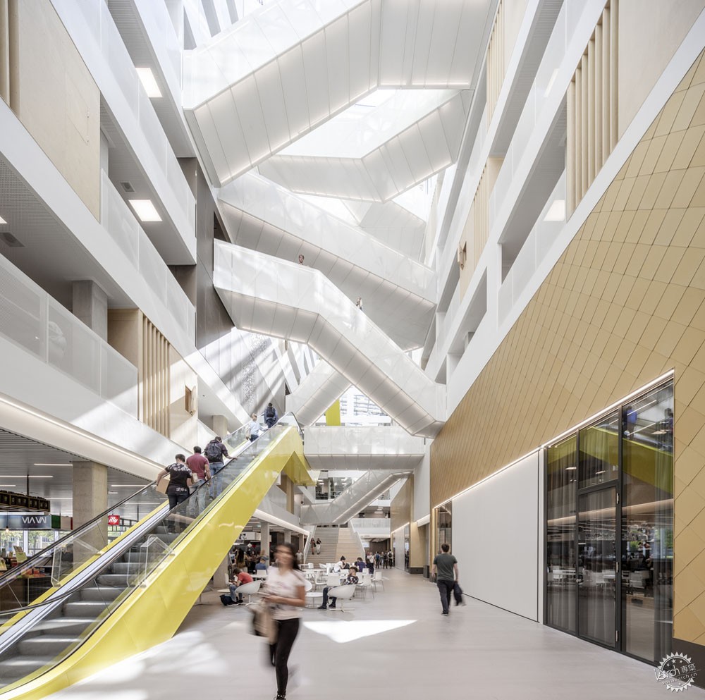
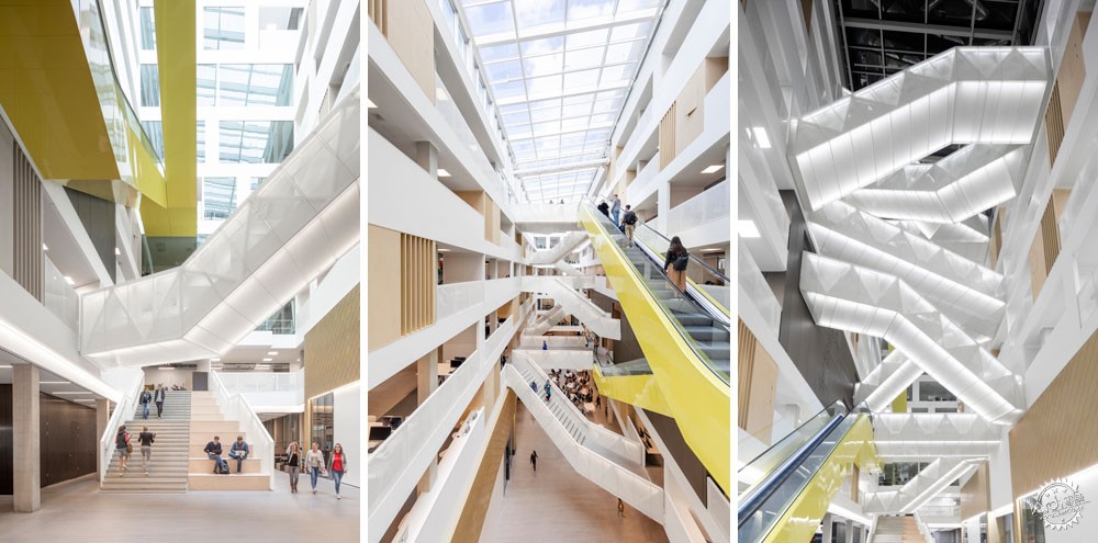
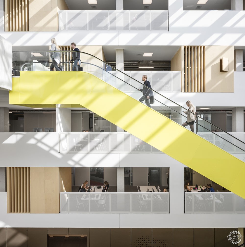
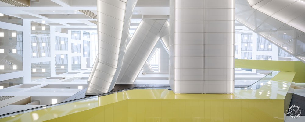
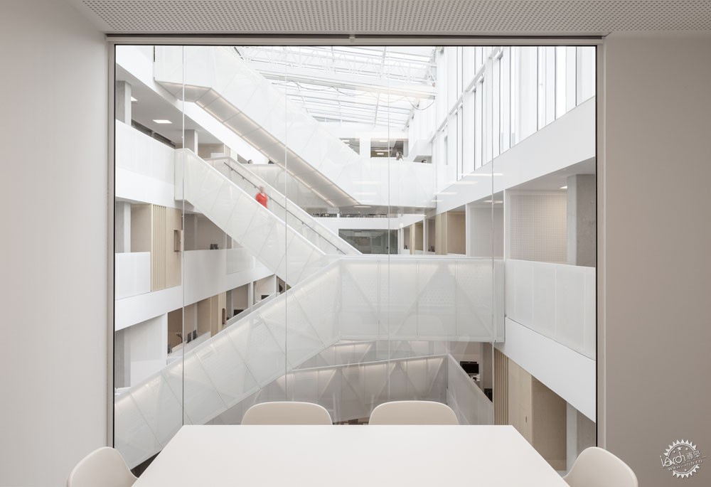
穿过主要入口,展现在人们面前的是光线柔和的垂直空间,这里设置有楼梯、自动扶梯、室内空中廊道。大学内部由白色、米色、木材色调组成,穿过中庭的三条自动扶梯点缀有明黄色。
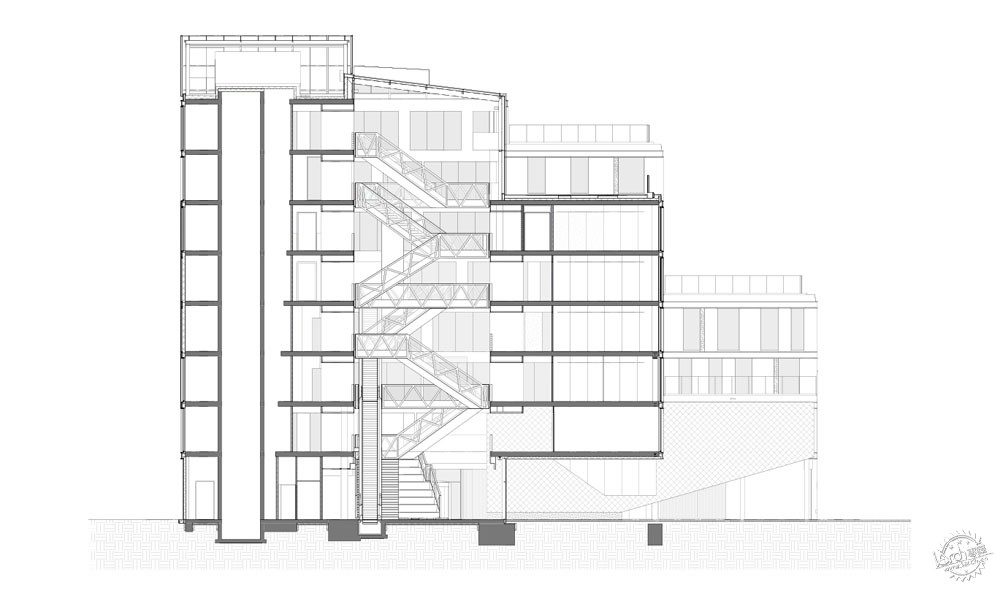
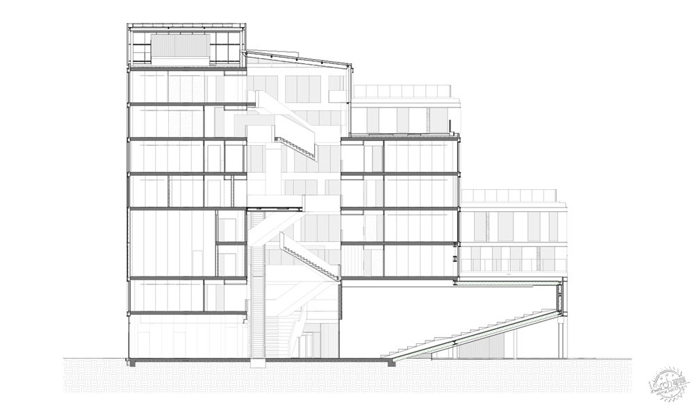
Moving through the doors of the main entrance, a softly-lighted vertical space opens up with a web of stairways, escalators and indoor bridges crisscrossing overhead. The white, off-white and timber color scheme of the university’s interior is accented with a pop of chartreuse that lines the three escalators that transverse the atrium.
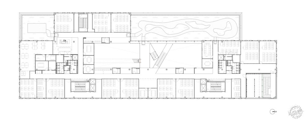
整个建筑中有60多间教室、两个90座的小型报告厅、20间项目团队工作室,这些空间都是跨专业共享的。合作工作区沿着中庭而设置,是个木盒子空间,能够容纳一至两个人。整个设计方案展示了空间的高效性,书桌位于墙体后侧,面向整个中庭。
Also placed throughout the building are more than 60 classrooms, two smaller lecture halls that each seat 90 people, and 20 project group rooms, all of which are shared across institutes. Timber boxes placed along the central atrium are concentration workspaces fit for one or two people to meet or study. Demonstrating the efficient use of space throughout the design, desk surfaces are built behind the walls overlooking the atrium.
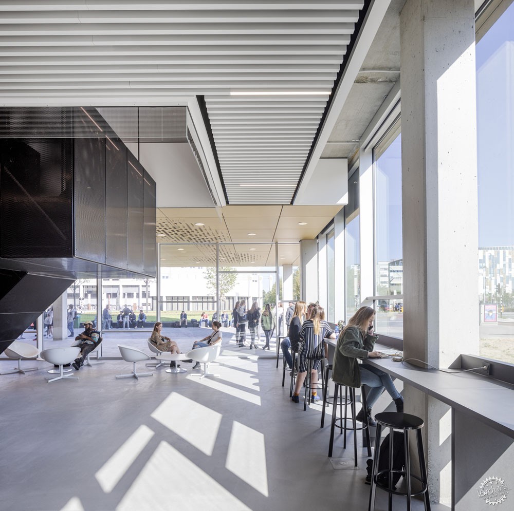
建筑的地面层很好地消除了室内外的边界,各个教育活动通过玻璃窗而得以展示。
The ground floor of the university is designed to erase the boundary between indoor and outdoor by putting educational activities on full display through full-length windows.
透明的空间也应用在地面层的两间报告厅的设计之中。大型报告厅分别能够容纳200人与260人,利用了玻璃幕墙和伸缩墙体,这与车库类似,伸缩墙体完全打开之后,能够与主要入口大厅连接在一起。
This transparency is also incorporated into the design of two lecture halls on the ground floor. Seating 200 and 260 people respectively, the large lecture halls feature glass walls and a retractable wall similar to a garage door that can open up completely to allow connectivity with the main entrance hall.
地面层设置有学生餐厅和其他餐饮设施,技术设施位于楼层的南侧,另外还有用于休闲会面的空间与充足的内置座椅。
The ground floor is completed with a student-run café and other dining options, technical facilities on the south side of the floor, and informal meeting spaces with an abundance of built-in seating.
沿着中庭向上,每个研究机构都有专门的学生研究区域,这些区域分布在六个楼层之中。这些区域是每个研究机构的核心部分,包含有特定的空间和设施,师生可以在这里沟通与交流。
Moving up through the atrium, each of the university’s institutes has a dedicated student and faculty center within the building, and they are spread out among the top six floors. The centers serve as the beating heart of each department and include institute-specific space and facilities for staff and students to meet and cross paths.
铝板面层也连接了建筑的内外表面。不仅可以在外立面上找到,也可以在内部楼梯上找到。楼梯上的穿孔元素有着声学功能,其下方设置有吸声材料,能够减少大楼中的日常噪音。
The exterior and interior are also linked by the moiré pattern of the aluminum cladding that can be found not only on the exterior façade but also on the internal staircases. The perforation on the staircases play a role in the acoustics of the space, and beneath them are sound absorption materials that dampen the noise made by the 5,800 people that use the building daily.





建筑设计:Schmidt Hammer Lassen Architects
地点:荷兰 乌德勒支
类别:Educational Architecture
主创建筑师:Kristian Ahlmark
面积:22310.0 ㎡
项目时间:2018年
摄影:Adam Mørk
客户:HU University of Applied Sciences
承包商:Besix & Strukton
结构工程:IMd
M&E:Deerns/ W4Y
声学与防火设计:Peutz
可持续设计:BREAAM Outstanding
Architects: Schmidt Hammer Lassen Architects
Location: Utrecht, The Netherlands, The Netherlands
Category: Educational Architecture
Lead Architects: Kristian Ahlmark
Area: 22310.0 ㎡
Project Year: 2018
Photographs: Adam Mørk
Client: HU University of Applied Sciences
Contractor: Besix & Strukton
Structural Engineer: IMd
M&E: Deerns/ W4Y
Acoustics and Fire Safety: Peutz
Sustainability: BREAAM Outstanding
|
|
