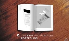
最优秀的建筑作品集设计
The Best Architecture Portfolio Designs
由专筑网李韧,韩平编译
申请建筑工作时,你需要确保自己有完美的作品集。虽然一个聪明并且有吸引力的名片可能会帮助你在最初得到公司的关注,但一个深思熟虑的简历或作品集也许更能证明您的价值。大多数情况下,您的作品集、你所参与的实际项目将用来衡量你的设计敏感性,并判断你的才能是否匹配的应聘的职位。
在3月,我们推出了许多读者发来的作品集,我们用ArchDaily社区分享最好的设计理念。我们在将近200份作品集中选取了以下几位,我们为大家展示的并不是这些作品的质量有多完美(虽然大部分作品都很优秀),而是着重于作品集本身的设计质量。我们寻找有创意的图形、逻辑清晰的作品,这些当然难以捉摸的珍贵属性我们将其统称为“创造力”。
在我们开始之前,我们对就如何设计作品集提出几点建议:
- 文件大小:现在,你应该知道发送太大的文件并不是一个明智的选择。虽然情况各不相同,但是也有一个约定俗成的标准,比如巴西建筑师Gabriel Kogan建议作品集的大小尽量保持低于15mb。
- 错别字和错误:如果你的作品集语言不是你的母语,那么请校对清楚。
- 长度和内容:制作作品集很耗时,所以很多人选择一次性完成。这是一个错误观念,为了进入一个公司,你需要在面试时表达不同的信息,所以你应该有个简洁的通用版本适用于各种场合,同时拥有一个信息较为完整的版本用于面试。最理想的情况是,不同版本的内容可以相互补充。你甚至可以考虑将你的作品集编辑成适用于各种不同工作的不同版本。
- 创造力:虽然创造力在作品集设计的表达中很重要,但它不能作为展示给大众的最终目的。
- 图像选择:在不同类型的图像之间找到平衡。例如,如果你要证明自己可以制作技术细节图,但是它们却没什么看点,选择一两个关键例子就足够。同样,虽然逼真的渲染令人印象深刻,但公司需要的是更多的建筑表达,以显示您作为一个建筑师的真正技能。
- 布局:避免杂乱,不要害怕留白。可以使用小空格,确保布局清晰,使作品集内便于阅读。
- 细节:一个平面设计的成败取决于小细节。使用风格一致的布局规则会使你的作品集具有统一感。
When applying for an architecture job, you need to make sure you have the perfect portfolio. While a clever and attractive business card might help you initially get a firm's attention, and a well-considered résumé or CV might help you prove your value, in most cases it will be your portfolio that makes or breaks your application. It's your portfolio that practices will use to measure your design sensibilities against the office's own style and to judge whether you match up to the talents claimed in your résumé.
That's why in March, we launched a call for our readers to send us their own portfolios so that we could share the best design ideas with the ArchDaily community. Our selection below shows the best of the nearly 200 submissions we received, which were judged not on the quality of the architectural design they showed (though much of it was excellent) but instead the design quality of the portfolio itself. In making the selection, we were looking for attractive graphics, a clear presentation of the work itself, the formulation of a visual identity which permeated both the architectural designs and the portfolio design, and of course that elusive and much-prized attribute: "creativity."
Before we get started, we thought we would take this opportunity to present our top tips for designing your own portfolio:
- File Size: By now, you should know better than to send a file that's too large. What exactly that means varies from situation to situation but as a guideline, Brazilian architect Gabriel Kogan recommends keeping the file size below 15MB.
- Typos & Mistakes: If the language of your portfolio isn't your native language, turn to online communities or ask someone to proofread it.
- Length & Content: Portfolios are time-consuming to put together, so it can be tempting to try to produce a "one size fits all" version. This is a mistake. Approaching a firm requires different information to presenting your work in an interview, so you should ideally have (at least) a two-page version of your portfolio for applications and a longer version for interviews. Ideally, this will also be supplemented by an online version of your portfolio. You may even consider tailoring your portfolio to each individual practice you apply to.
- Creativity: While creativity is important in a portfolio, it can't be at the expense of the work the portfolio is meant to be showcasing.
- Image Selection: Find the right balance between different types of image; it's good to demonstrate that you can produce technical detail drawings, for example, but they're not much to look at, so one or two key examples is plenty. Similarly, while photorealistic renders are impressive, they need to be complemented by more architectural representations to show your true skill as a designer.
- Layout: Avoid clutter and don't be afraid of white space. If you use little white space, ensure your layout is clearly structured so that the portfolio's contents are easy to absorb.
- Details: Often, the strength of a graphic design lies in small details. Use certain layout rules consistently and it will give your portfolio a sense of cohesion.
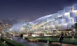
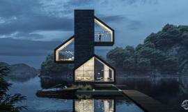
Gregory Barber

Submitted by Gregory Barber
关于设计:“我的目标是使它尽可能简单,许多身临其境的轴侧图纸和模型透视照片,让我清晰地叙述了这个设计故事。”
为什么我们喜欢它:Gregory的选择和作品集的图像,以及图纸和文本,正是他想要的:整个项目一目了然。工程图纸叠加在图像上的方式将它们合并成一个整体,它们相互强调,互为因果。
About the design: “I aim to make it as simple and immersive as possible with many axon drawings and full bleed model perspective photos that allow me to tell a story in just one glance.” - Gregory
Why we like it: Gregory’s selection and combination of images, drawings, and text does exactly what he intended: tell a story at a glance. The way that drawings are overlaid onto images unites them into one mental bite, and they enhance and clarify each other.

Submitted by Gregory Barber

Submitted by Gregory Barber
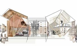
Vingan Razvan

Submitted by Vingan Razvan
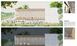
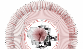
我们喜欢它的利用:这个作品集中的每一个设计都有一整套的设计图纸:一些平面图、剖面图、立面图和表格。整洁和流畅的布局,让建筑为自己说话。
Why we like it: Each design in this portfolio is presented with a full set of design images: plans at a number of scales, sections, elevations, and diagrams. Neatly and consistently laid out, this one really lets the architecture speak for itself.

Submitted by Vingan Razvan

Submitted by Vingan Razvan
Wilmer Coronado Castillo

Submitted by Wilmer Coronado Castillo
关于设计:“你知道很多时候,好奇心主宰着我们的生活。只要你决定打开盒子,你就可能会发现涂鸦,那也是我作品集表达的核心思想,从一个有趣的盒子开始,包括几个项目,他们能够立即识别我的工作风格。”—— Wilmer
为什么我们喜欢它:在网络世界里,创建一个只能快递而不能发送邮箱的作品集,这个想法十分大胆。在这种情况下,我们认为勇气值得回报,没有建筑师会忘记曾经收到过这个作品集。
About the design: “You know that much of the time, curiosity dominates our lives. As long as you decide to open the box, you will find scribbles that ended up being part of my best ideas... Starting from an intriguing-looking box that includes a few projects, they immediately make recognizable a working style.” - Wilmer
Why we like it: In an online world, it’s brave to create a portfolio that only works when sent physically—and in a parcel rather than an envelope, no less. In this case, we think that bravery pays off, and no architect will forget receiving this portfolio.

Submitted by Wilmer Coronado Castillo

Submitted by Wilmer Coronado Castillo
Derek Pirozzi

Submitted by Derek Pirozzi
关于设计:“这个作品集的意图是保持所有信息的直接和凝聚力。每个作品集的传播都是为创建相对独立的作品表达。”——Derek
为什么我们喜欢它:建筑师经常建议保持文本极简的图形演示。但是当你有太多的话要说时,你会怎么做?这是一个很好的例子,一个作品集,使用了大量的文本,但同时也不丢弃视觉感受。
About the design: “The intent of this portfolio was to keep all information direct and cohesive. Each portfolio spread seeks to create separate comprehensive spreads which are geared towards 1 proposal per spread.” - Derek
Why we like it: Architects are often advised to keep text to a minimum in their graphic presentation. But what do you do when you’ve simply got too much to say? This is a great example of a portfolio that uses a lot of text, but does so without taking focus away from the visuals.

Submitted by Derek Pirozzi

Submitted by Derek Pirozzi
Rina Ben Shimol

Submitted by Rina Ben Shimol
关于设计:“白色。”——Rina
为什么我们喜欢它:这是一个简单的作品作品集概念,简约的色调和它的高度识别性。
About the design: “White on white.” - Rina
Why we like it: This online portfolio takes a simple concept—a perfect minimalist color palette—and sees it through to its conclusion to instill a strong identity.
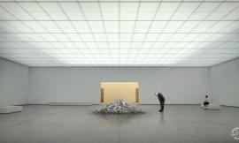
Cristóbal Riffo

Submitted by Cristóbal Riffo
为什么我们喜欢它:这个作品集的布局有着令人难以置信的严谨:几乎所有情况下,每页都有一个图像。任何辅助信息,如页码和项目标题,都尽可能小地显示出来,而将重点放在作品表达上。该作品集的特点是简单,干净,醒目。
Why we like it: The layout of this portfolio is incredibly strict: in almost all cases, there is exactly one image per page. Any auxiliary information, such as page numbers and project titles, is shown at an absolutely minimal size to bring out the strength of the work. The portfolio is simple, clean, and striking.

Submitted by Cristóbal Riffo

Submitted by Cristóbal Riffo
Miguel Roig Burgal

Submitted by Miguel Roig Burgal
关于设计:“我想用自己的方式去做建筑,这就是为什么我认为自己的作品作品集非常简约,没有太多的资料和图纸,只有那些我认为足以吸引人的项目才会放多一些篇幅。从排版到图像,整个作品集非常轻松优雅,这是我自身设计表达的准确反映。”——Miguel
为什么我们喜欢它:关于这个设计的最引人注目的事情是每个图像被裁剪到其内容的边缘,而不是一个简单的矩形。在效果图中没有天空,随着图纸和表格创建有趣和灵活的留白空间。
About the design: “I wanted to show my way of seeing and doing architecture, that's why I consider my portfolio very minimalistic, without too much information and drawings, only the ones I consider enough to explain the projects. From the typography to the position of the images and schemes, the whole portfolio is very light and elegant which its an accurate reflection of me.” - Miguel
Why we like it: One of the most striking things about this design is the way each image is cropped to the edge of its content rather than to a simple rectangle. There are no skies in the renderings, which along with the orientation of plans and diagrams creates an interesting and flexible white space that changes with every page.

Submitted by Miguel Roig Burgal

Submitted by Miguel Roig Burgal
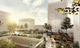
Li Dai

Submitted by Li Dai
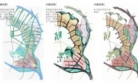
为什么我们喜欢它:这个作品集显示了Li Dai的工作内容,除了通常的渲染效果图和图纸,还包括表格、图形,甚至漫画。重要的是,每一个新项目与标题页面布局结构严格一致,以不同方式呈现出来。
Why we like it: This portfolio shows the full extent of Li Dai’s range, including diagrams, graphs and even comics in addition to the usual renders and drawings. Importantly, each new project is announced with a strict and consistent title page layout, giving structure to what would otherwise be a cacophony of different presentation styles.

Submitted by Li Dai

Submitted by Li Dai
Maël Barbe

Submitted by Maël Barbe
关于设计:“通过这种方法,加强项的目的性,表达建筑所希望表达的氛围。它以游戏的方式揭示了感官体验以及激进的且具有强烈对比性的建筑构架。”——Maël
为什么我们喜欢它:单色和高度对比的设计,这个作品集结合了一些不同的演示技术,包括草图和模型照片。
About the design: “Through this approach the character of the projects is intensified and releases the essence of the desired atmosphere. It reveals a sensory and radical architecture by the play of a strong contrast.” - Maël
Why we like it: The monochrome and highly contrasting design of this portfolio unifies a number of different presentation techniques, including sketches and model photos.

Submitted by Maël Barbe

Submitted by Maël Barbe
Benjamin Wichman

Submitted by Benjamin Wichman
关于设计:“这个作品集的排版运用了几何大字体和直接的触觉意象,用以支持手工和叙事过程。”——Benjamin
为什么我们喜欢它:如预期,这种独特的展示方式表达的是设计的过程而不是结果,通过剪贴簿保留设计痕迹,用这种方式了解Benjamin的工作能力。
About the design: “This portfolio layout blends the flat design of large geometric typefaces and full bleeds with the skeuomorphism of tactile imagery, championing handcraft and the narrative of process.” - Benjamin
Why we like it: As intended, this unique design showcases the process of design and not just its outcome, coming across a little as a kind of design scrapbook that shows how Benjamin thinks through his work.

Submitted by Benjamin Wichman

Submitted by Benjamin Wichman

Submitted by Benjamin Wichman
Eytan Levi

Submitted by Eytan Levi
关于设计:“经过一些作品集试验,我发现,运用白色空间能够增强图像之间的联系,这是我设计这个作品集时的主要指导方针。在每个项目的开始用圆形图像提醒读者,他即将开始欣赏到一个新项目。”——Eytan
为什么我们喜欢它:在这个作品集中使用大量白色空间十分大胆。因此,每一个图像显得珍贵和重要。优秀的扉页布局体现了作者核心的组织能力。
About the design: “After a few portfolio trials, I found out that having a lot of white space enhances and strengthens pictures and drawings. This is the main guideline I used while creating this portfolio. The circle image at the beginning of each project reminds the reader he is looking at something new.” - Eytan
Why we like it: Almost paradoxically, the use of white space in this portfolio is somewhat brave. Each image thus appears precious and important. The excellent layout of the title pages brings a crucial level of organization.

Submitted by Eytan Levi

Submitted by Eytan Levi

Submitted by Eytan Levi
Aayush Jindal

Submitted by Aayush Jindal
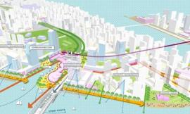
为什么我们喜欢它:这一作品集的关键是图像的选择:Aayush的天赋是把渲染图的戏剧呈现,由于图幅比较大,至少占用了一半的页面空间。
Why we like it: The key to this portfolio is image selection: Aayush’s flair for dramatic renders is put in the spotlight thanks to large images that take up at least half of an entire spread.

Submitted by Aayush Jindal

Submitted by Aayush Jindal
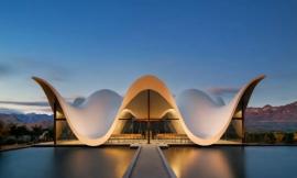
Lazar Belic

Submitted by Lazar Belic
关于设计:“我的作品集只有一个项目,用以解释背后的设计方法。该项目从概念和文本描述开始,伴随着一般信息、关键词和可视化效果。这是演示文稿的层次组织:介绍场所,总体量、结构、空间组织、内饰和细节。这样,一个项目涵盖了不同的尺度和话题。”——Lazar
为什么我们喜欢它:当你有一个设计,你觉得能够展示最好的一切,甚至没有更好的方式来呈现它。事实上,作品集甚至有点像一个媒体发布会,在尽可能少的时间内给出一个完整的项目。
About the design: “My portfolio contains only one project, explaining the design methodology behind it. The project starts with the textual description of concept and context, accompanied with the general info, keywords and the visualization. There is hierarchical organization of the presentation: introduction to site, general massing, structure, space organization, interiors and details. In this way, one project covers different scales and topics.” - Lazar
Why we like it: When you have one design which you feel showcases the best of everything you have to offer, there’s no better way to present it than this. In fact, the portfolio even feels a little like a media release, giving a complete look at the project in as little time as possible.

Submitted by Lazar Belic

Submitted by Lazar Belic
Thea Mihu

Submitted by Thea Mihu
关于设计:“我用A4页面来排版,InDesign布局。作为图形,我喜欢用颜色来强调需要展示的主要特点呈现/计划/图表/技术细节。”——Thea
为什么我们喜欢它:这是一个很好的例子,使用不同色彩为作品集带来识别性。
About the design: “I worked with a A4 page size layout and had a templet layout drawn in InDesign, which I used for most spreads, for example focusing the main subject into a square. As for graphics, I like to use colour to emphasise the main features of the exposed renders/plans/diagrams/technical details.” - Thea
Why we like it: This is a great example of using color to bring an aesthetic identity to a collection of work.

Submitted by Thea Mihu

Submitted by Thea Mihu
Bastian Marzoli

Submitted by Bastian Marzoli
关于设计:“平时我们主要是在屏幕上看到作品集,然而对我来说更合乎逻辑的方式是设计一个简单和有趣的网站。我的作品集的每一个类别都用一个独特的字母来作为引导,同时也增加了网站的神秘感。这个新思路对我来说十分重要,我设计了不同的菜单和动画,只是为了创造一个充满惊喜的旅程,从而让别人发掘我的工作能力。”——Bastian
为什么我们喜欢它:这个好玩有趣的作品集,十分迷人。设计提供了所需的神秘性,它也具有清晰和有吸引力的布局。
About the design: “In an age when portfolios are to be seen mainly on a screen, the more logical way for me was to design mine in the shape of a simple and playful website. The use of one unique letter for each category of my portfolio allowed me to keep the navigation menu very simple while adding a sense of mystery to the website... This idea of a new place that you have to discover almost by wandering around was important to me, and I designed the different menus and animations in order to create a journey full of surprises, thus entertaining the visitor while letting him discover my work.” - Bastian
Why we like it: This playful and intriguing online portfolio is beautifully presented. While the design certainly provides the desired mystique, it also makes for a clean and attractive layout.

Submitted by Bastian Marzoli

Submitted by Bastian Marzoli

Submitted by Bastian Marzoli
Keyhan Khaki

Submitted by Keyhan Khaki
为什么我们喜欢它:每一个给定的图像填满布局空间,简单的图像又确保空间不会太满。作品集组合的设计补充了建筑方案本身,让整个项目具有强大、沉思的感觉。
Why we like it: While each image fills the space that it is given, the simple four-way split used on each spread ensures that the space doesn’t feel over-full. The design of the portfolio complements the architecture itself to give the whole document a strong, brooding feel.

Submitted by Keyhan Khaki

Submitted by Keyhan Khaki
Pilar Ribot Reus

Submitted by Pilar Ribot Reus
关于设计:“整个设计基于简约,只显示了有代表性的图像。页面的留白成为这些图像的一部分。”——Pilar
为什么我们喜欢它:这又是一个勇敢使用白色空间的例子,文本和项目本身组合成了一个完美的设计。
About the design: “Based on simplicity, where only strong and representative images are shown. The blank of the page becomes part of these images.” - Pilar
Why we like it: Another example with a brave use of white space, this design considers the composition of whole pages and executes these compositions beautifully.

Submitted by Pilar Ribot Reus

Submitted by Pilar Ribot Reus

Submitted by Benjamin Wichman

Submitted by Benjamin Wichman

Submitted by Cristóbal Riffo

Submitted by Cristóbal Riffo

Submitted by Cristóbal Riffo

Submitted by Eytan Levi

Submitted by Eytan Levi

Submitted by Keyhan Khaki

Submitted by Li Dai

Submitted by Li Dai

Submitted by Li Dai

Submitted by Maël Barbe

Submitted by Miguel Roig Burgal

Submitted by Wilmer Coronado Castillo

Submitted by Wilmer Coronado Castillo

Submitted by Wilmer Coronado Castillo
出处:本文译自www.archdaily.com/,转载请注明出处。
|
|