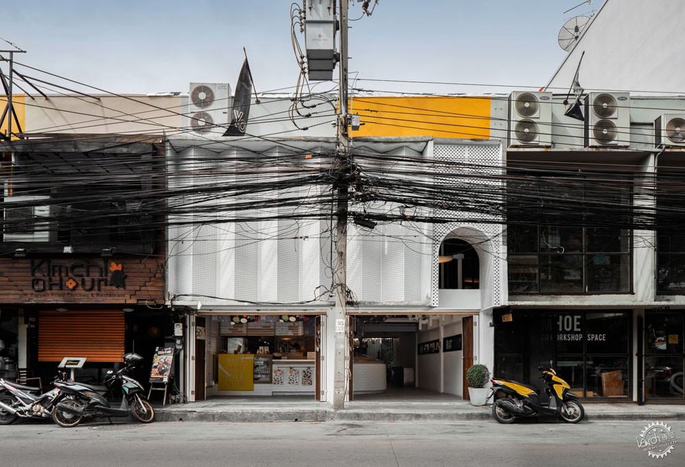
曼谷Dondon翻新项目
The Renovation of Dondon / FATTSTUDIO
由专筑网李韧,王帅编译
来自建筑事务所的描述:在过去的10年里,Ari区曾是泰国曼谷的时尚地区,这里开着很多高品质的咖啡店,各式各样的咖啡和餐厅琳琅满目。伴随着城市的逐步扩张,许多公司和共管公寓从市中心发展出来,搬到了这个地区周围。这些公司有许多工作人员,因此也带动了这个地区的经济发展。使这里从多样化咖啡厅转变为餐厅聚集地,如何吸引这些工作人员和附近居民成为了建筑师的一大挑战。
Text description provided by the architects. In the last decade, the Ari district used to be the hipster area in Bangkok which contains with good quality of coffee shops including with varieties cafés and restaurants in the old days. When the city has expanded, many firms and condominiums outgrew from the city center to relocate around the district. The companies came with numbers of working people that affected to demand around the area. From alternative cafés area transformed to the battlefield of restaurants which are competing for officers and the new high ground neighborhood.
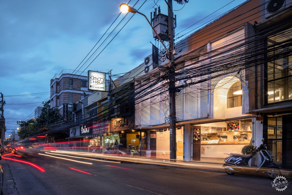
项目的客户拥有联排别墅的3个单元,而这些单元之间却没有明确的连接体,其中两个单元是名为“Made here on earth”的木质工作空间,而另一个则是名为“Yo”的酸奶咖啡厅。项目的主要解决的问题为联排别墅及一家名为“SA-Ti”的风格咖啡店的后方设置的一座庭院。另外,沿街入口必须先经过酸奶咖啡厅。因此这个问题直接影响了咖啡店,因为即便顾客在谷歌地图上搜到这座院落,他们也不知道该如何进入。因此建筑师需要解决这个问题,这个新项目是位于现有住宅之间的Bento bar和全新住宅。
A project start with the client had 3 units of row houses which didn’t connect clearly, the 2units is wooden workshop named “Made here on earth” and the other one is a yoghurt café named “Yo”. The main problem was they also had settled nice courtyard behind the row houses that come along with styling coffee shop, is named “SA-Ti” However, the entrance from the street had to access through the yoghurt café. The issue affected to the coffee shop directly because a customer didn’t realize where was the courtyard even though they found on google map. We were called to solve the conflict and came with the new program which was delivered, The new program was Bento bar and the new row house between existing the row houses was taken already.


Dondon是一家致力于为人们提供高质量餐饮的日式Bento bar,尤其针对附近公共关系部门的工作人员。但是,对于人们的日常生活而言,这些便当的价格也必须亲民。
The Dondon is a Japanese bento bar which aims to provide a good quality meal for working people, Especially officers who are working for the public relations department opposite the site. However, the food box must have a reasonable price for everyone and customers could be effort every working day.
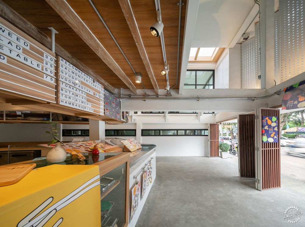
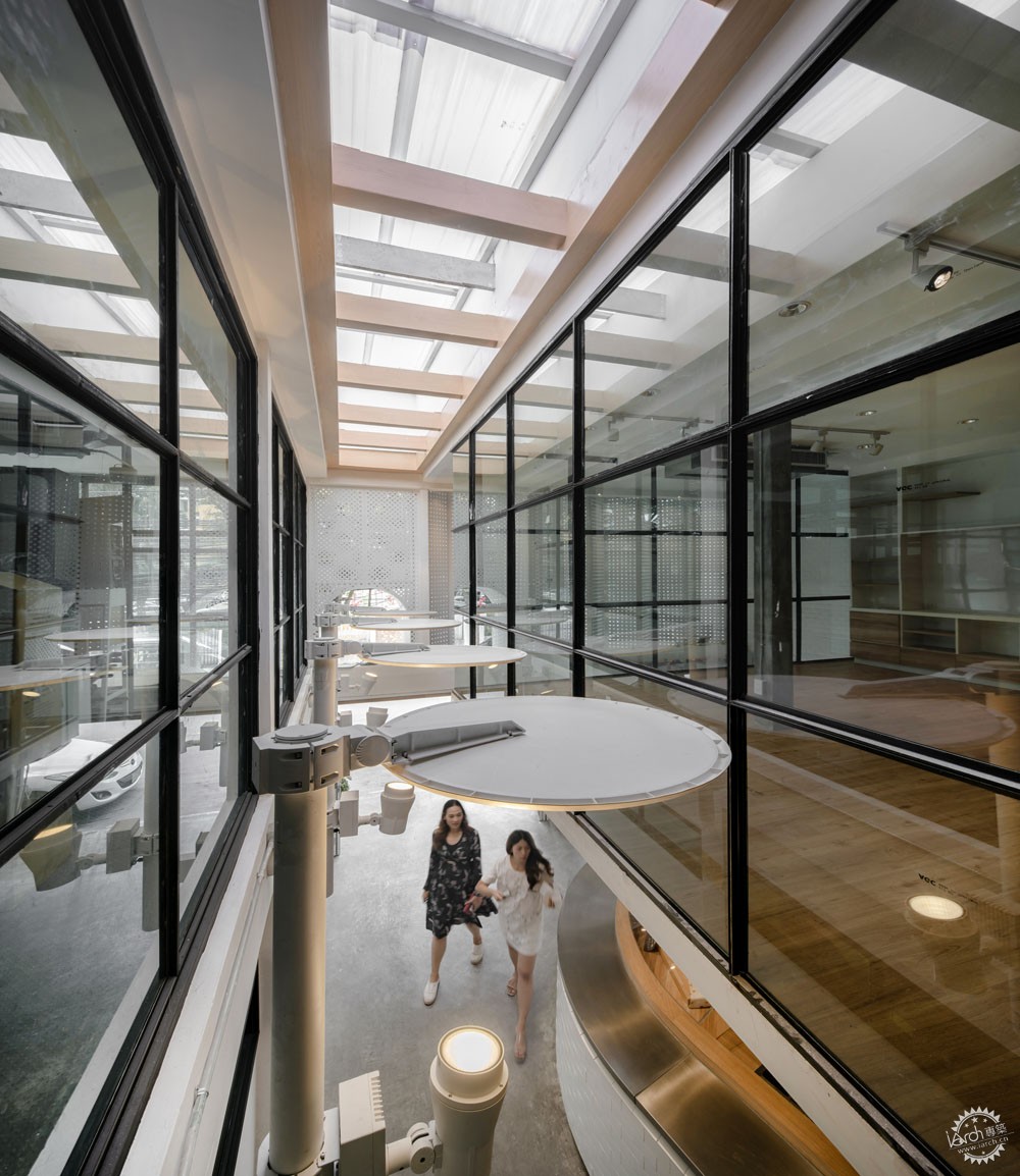
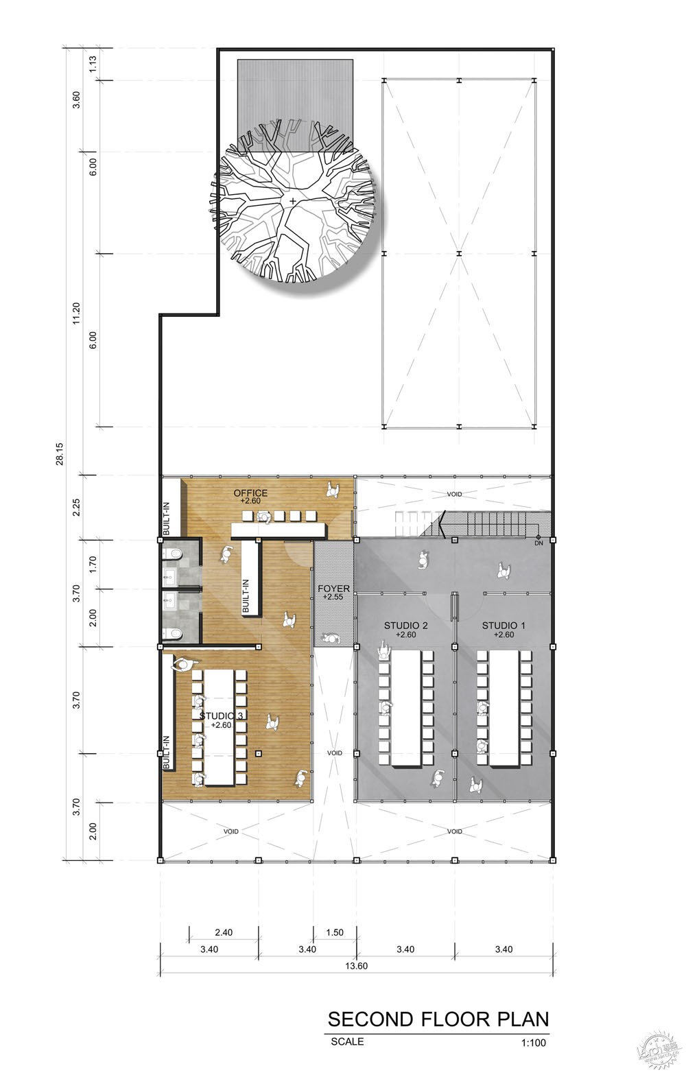
首先,建筑师以街道至建筑后方的庭院的主要流线作为切入点,并且翻新Yo咖啡厅和旁侧的一家咖啡厅。这两座住宅的墙体被拆除,然后连接至地面层。在一层,建筑师同样拆除了墙体和地面,并且安装了全新的咖啡设施。同时拆除了上部空间,建筑的屋顶形态也已改变,同时安装了聚碳酸酯屋顶面板,让阳光进入内部。
First of all, we intended to manage the main circulation from the street to lovely courtyard behind the building as our main concern. We planned to renovate the Yo café and the beside one. The duo row houses were demolished walls to connected the ground floor. On the first floor, we also demolished all the walls and floor to reinstall new criteria instead. Above the space was also demolished, the roof had been changed and installed polycarbonate roofing panel on some area to lets the sunlight come into the area.
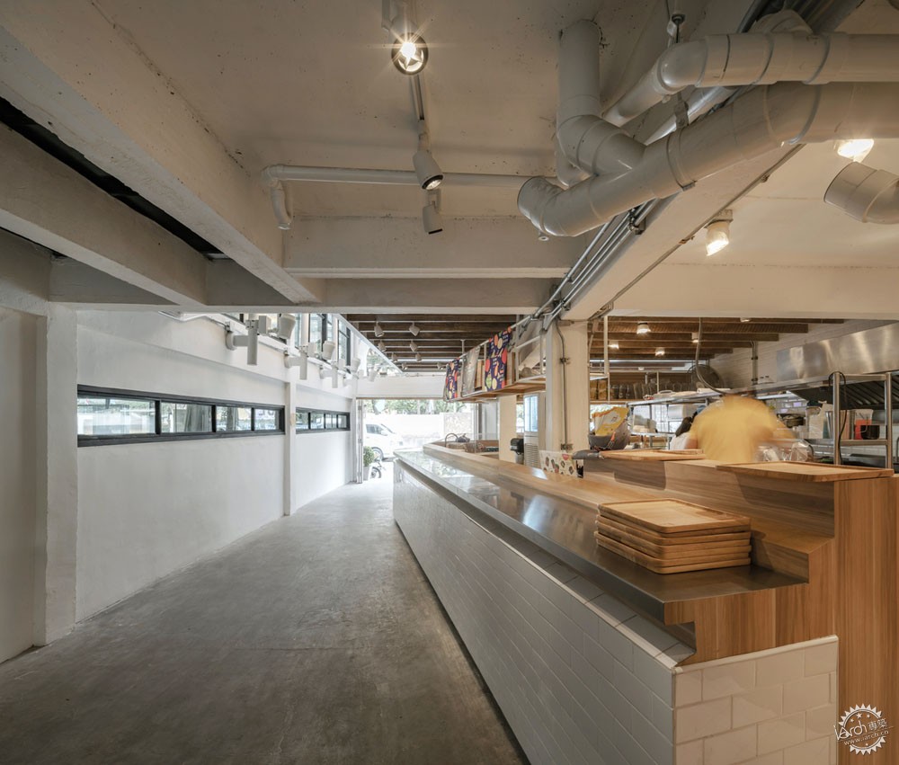
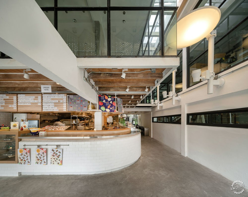
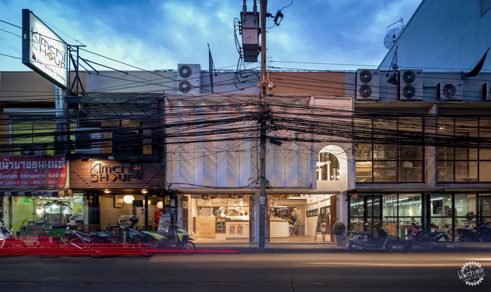
根据Dondon的地理位置,设计师将入口廊道旁侧设置为开敞式厨房,这里也是从街道通向院落的入口区。随后,建筑师放弃了空调系统,因为这座柜台 主要售卖便当。建筑的立面可以抵御当地的暴风雨,但是仍然保留有自然通风,这样能够减少开放式厨房所带来的高温,尽可能地让廊道凉爽一些。建筑一层的空腔经过重建,尺寸减小了很多,与建筑立面之间形成一定的空隙。部分楼层空间形成建筑的主要入口通高空间,将人们引入舒适的内部院落。街道照明设施同样也是建筑的一部分,这里仍然作为人行步道。
According to the positioning of the Dondon, It was defined as open kitchen bar beside the entrance corridor which mean we designed the main entrance corridor from the street to the courtyard and located the bar beside the wall. After that, we decided to reject the air-conditional as usual the neighbor always do because the bar concept is takeaway meal box. The façade design was designed to project heavy rain from outside but It still allows natural ventilation to reduce heat from the open kitchen and chill the entrance corridor. The façade is working with the first-floor void which was removed and reinstall in a smaller size. The missing piece floor turned to be the main entrance double space approach people to get into comfortable courtyard inside. The street light was the last ornaments which remain people who walk through the entrance hall as the footpath.
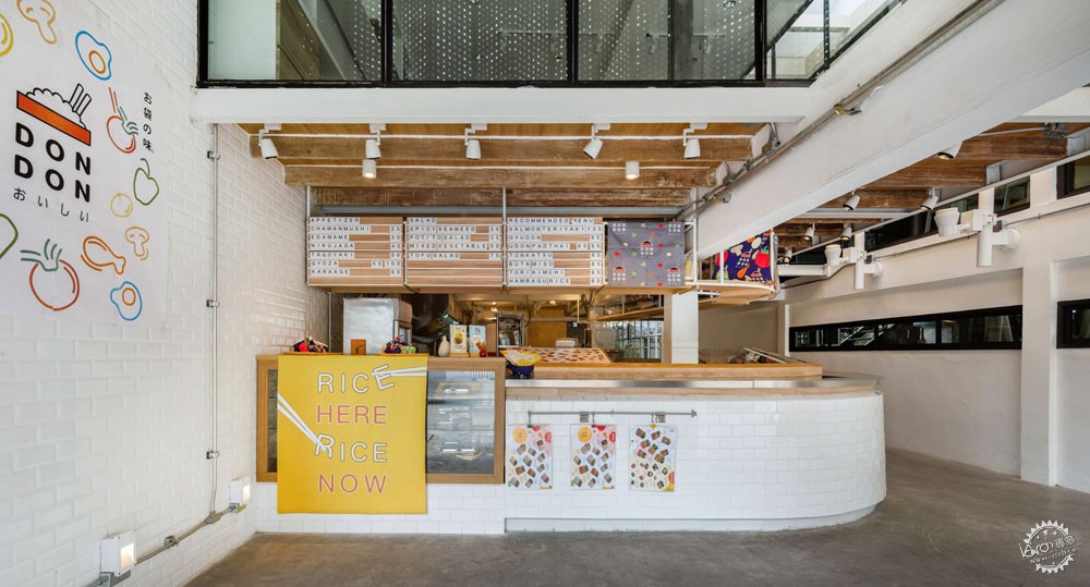
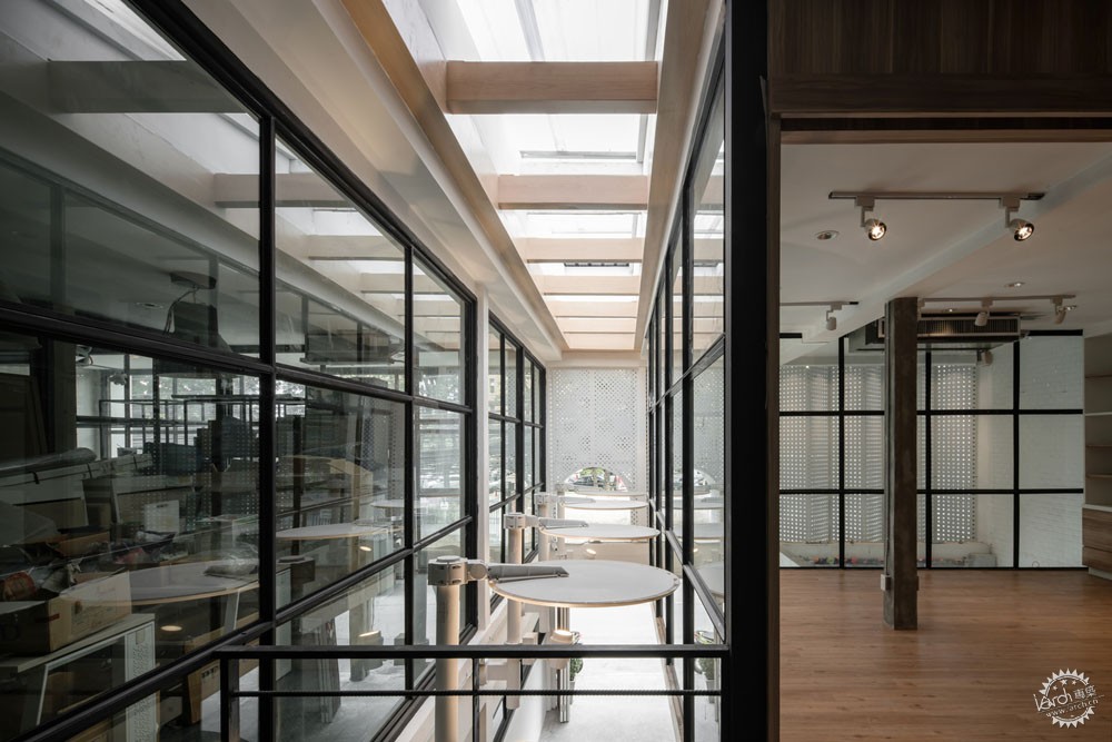
最后,白色穿孔铝制立面、聚碳酸酯天窗,全新布局的上部楼层共同协作,营造出高品质的入口廊道,人们可以在辛苦的工作之后来到院落当中惬意地品尝咖啡,也可以在午餐时间购买美味的便当,并且享受愉悦的交流时光。
Finally, the white perforated aluminum façade, polycarbonate skylight, and the new layout upper floor have worked together, the good quality of entrance corridor has become, people could walk into the comfy courtyard to sit and drink good coffee after hard working weekday, properly. In the precious lunchtime, they could have a little walk to buy delicious meal box for lunch and have more time for enjoyable conversation.

建筑设计:FATTSTUDIO
地点:泰国,曼谷
设计团队:Supanna Chanpensri, Pomped Sathornterawat, Noppanan Sinpru, Vipada Simtamnimit, Apinat Jongphianmungmart
面积:210.0 m2
项目时间:2018年
摄影:Panoramic studio - Thinnapop Chawatin
设计指导:Wattikon Kosonkit
室内设计:Jindamart Pudsa
Architects: FATTSTUDIO
Location: RamaVI, Rd Phaya-Thai Bangkok, Thailand
Design Team: Supanna Chanpensri, Pomped Sathornterawat, Noppanan Sinpru, Vipada Simtamnimit, Apinat Jongphianmungmart
Area: 210.0 m2
Project Year: 2018
Photographs: Panoramic studio - Thinnapop Chawatin
Design Director: Wattikon Kosonkit
Interior Design: Jindamart Pudsa
|
|
