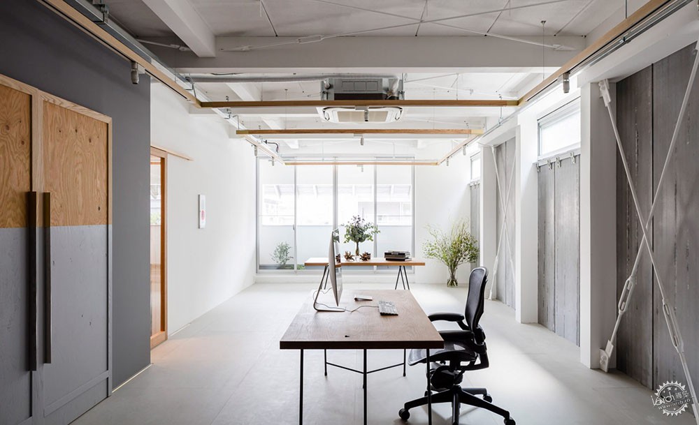
Shimpei Oda和Tetsuya Tanji用极简的方式设计了一间办公室
Shimpei Oda and Tetsuya Tanji keep things minimal in studio for graphic design office Panda
由专筑网麻雀,小R编译
日本建筑师 Shimpei Oda 和 Tetsuya Tanji只用了最简单的方式就将Nara的一间未完成的办公室改造为设计工作室。
这两位建筑师为平面设计工作室Panda设计了这一办公地点。
Japanese architects Shimpei Oda and Tetsuya Tanji made only subtle changes to this unfinished office unit in Nara, to turn it into a design studio.
The two architects, who lead the studios Shimpei Oda Architect Office and Atelier Loowe, created the workspace for graphic design office Panda.
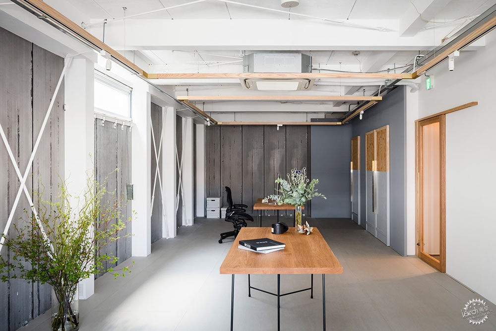
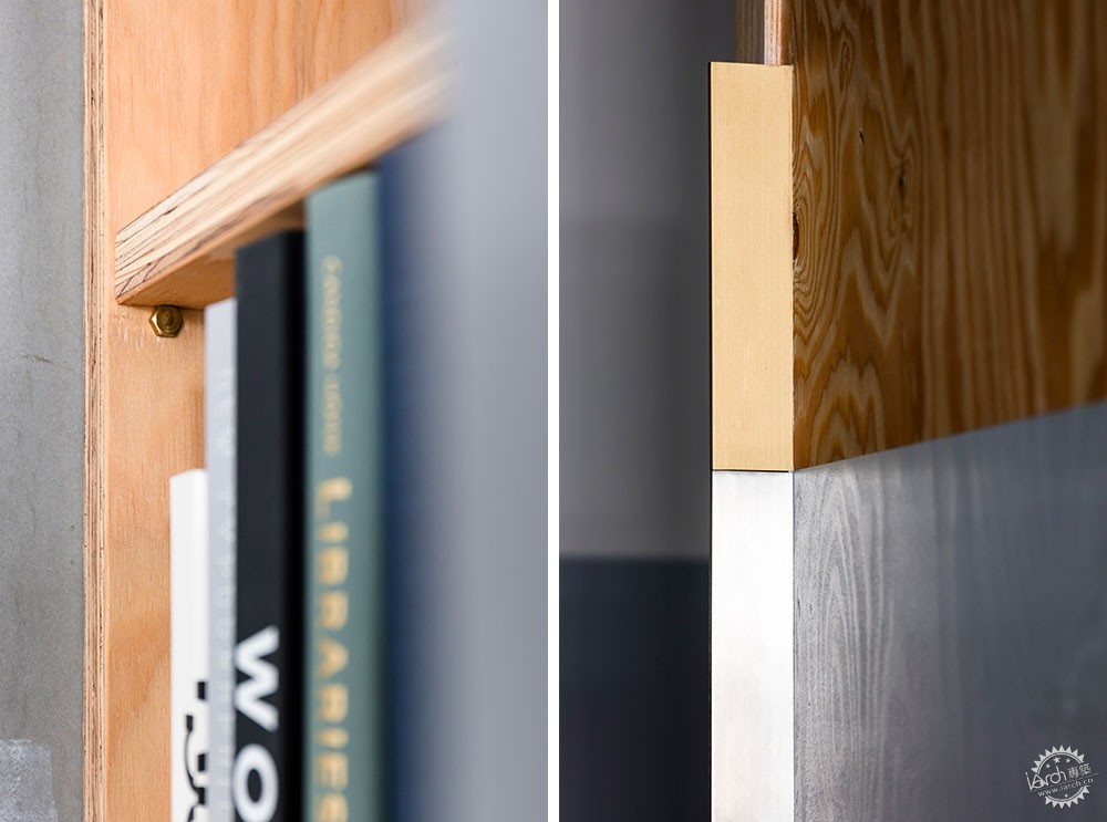
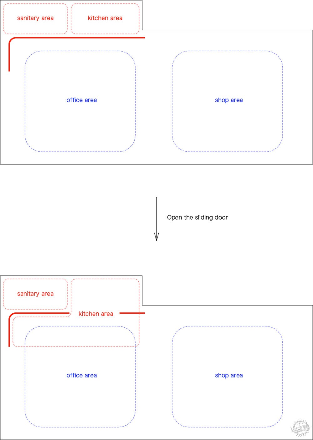
他们的主要干预措施是在一个角落增加一堵新的隔墙,在墙角后面,他们创造了厨房、浴室设施和少量的货架储藏室。
其余45平方米的空间处理得非常简单,只有必要的家具和一些装饰植物。
Their main intervention was to add a new partition wall wrapping one corner, behind which they created a tiny kitchen, bathroom facilities and a small amount of shelving storage.
The rest of the 45-square-metre space is kept very simple and minimal, with only essential furnishings and a few decorative plants.

室内保留了原有的建筑细节,现有的墙壁和天花板表面完全保持原样。
“挤压水泥板的内墙和混凝土天花板,是由于原来的内部空间并不完整。”Oda解释说:“然而,由于独特的纹理,让这里变成了具有自身魅力的空间。”
The existing wall and ceiling surfaces, embellished by steel cross-bracing and other industrial details, were left exactly as they were.
"With inner walls of extruded cement board and a concrete ceiling, the original internal space was incomplete," explained Oda. "However, with its unique textures, it was a space with its own charm."
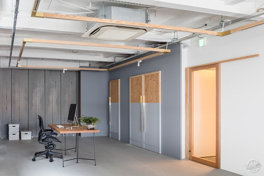
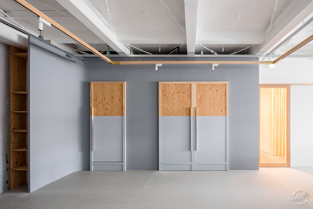
新的L形隔墙涂上了柔软的灰色调油漆,与现有的空间相融合。
一侧的单门通向浴室,厨房设置在一对双门后面。
The new L-shaped partition wall is painted in a soft grey tone that complements the existing surfaces without matching them.
A single door on one side leads through to the bathroom, while the kitchen is set behind a pair of double doors.
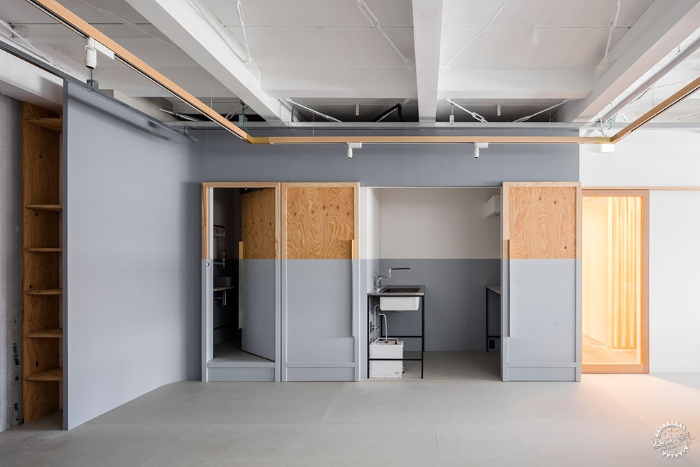
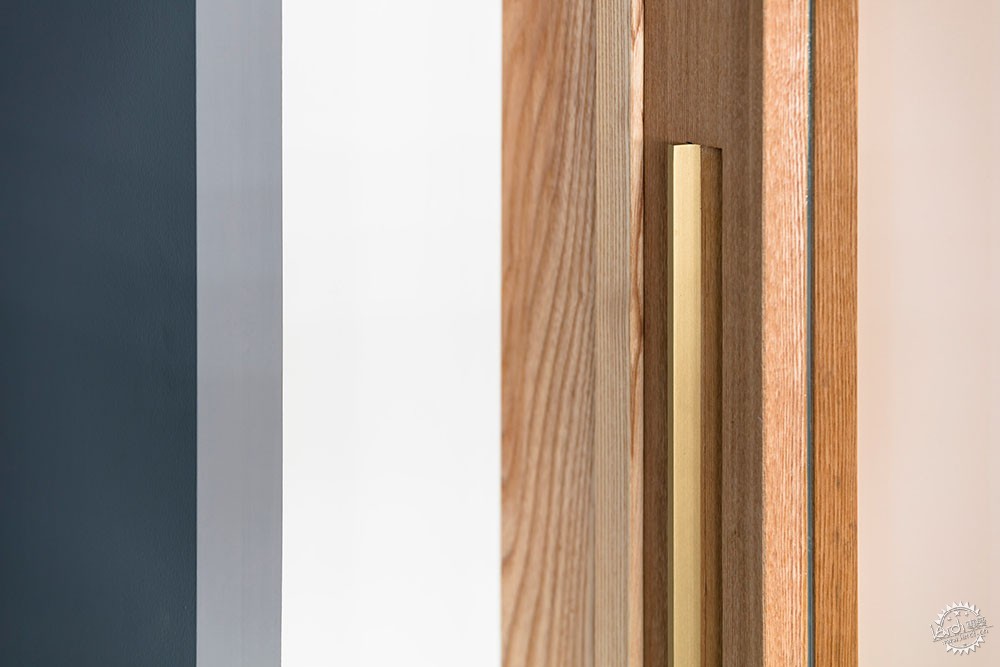
所有的三门都在底座上漆成灰色,但是木材的原始色调和纹理在上半部露出。
这种双色系延续到了建筑后面的空间,包括浴室的镜子。Oda将其描述为对工作室名称“Panda”的引用。
All three doors are painted grey at the base, but the original tone and texture of the wood is left exposed on the top half.
This two-tone colour system continues into the spaces behind, including over the mirror in the bathroom. Oda describes it as a reference to the studio name Panda.
这位建筑师说:“在门完全打开的情况下,油漆内部的垂直线和颜色与门相连,并将功能整合到主要空间中。”
他补充道:“同样考虑到功能性,我们重新绘制了底部,那里可能会更容易出现污垢、磨损和撕裂等痕迹。”
"With the doors fully opened, the vertical line and colour of the painted interior connects with the doors and integrates the functions out into the main space," said the architect.
"Also considering functionality, it is easy to repaint the bottom part where dirt, wear and tear is more likely to show with regular use," he added.

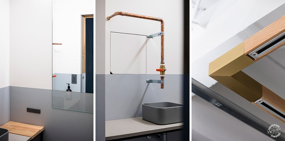
该空间的其他极简化细节包括一个集成在悬挂木框架中的照明系统和一个由水管直接连接的浴室盆。
Other minimal details in the space include a lighting system integrated into suspended wooden frames and a bathroom basin served directly by a water pipe.
Oda常常致力于室内空间的极简化设计,曾经的项目由一套带有内部阳台的公寓,以及一座上世纪20年代的住宅翻新。
在最新的设计中,他说这是“旨在创建具有抽象区域的连续空间”。
摄影:Norihito Yamauchi
Oda often creates minimal designs for interiors. Previous projects include a studio flat with an "inner balcony and a renovated 1920s house.
Reflecting on this latest design, he said it "aims to create a continuous space with abstract areas".
Photography is by Norihito Yamauchi.
项目信息:
建筑事务所:Shimpei Oda Architect Office, Atelier Loowe
主创设计师:Shimpei Oda, Tetsuya Tanji
灯光设计:New Light Pottery, Koizumi Lighting Technology
景观设计:Hiratile
Project credits:
Architecture: Shimpei Oda Architect Office, Atelier Loowe
Lead architects: Shimpei Oda, Tetsuya Tanji
Lighting: New Light Pottery, Koizumi Lighting Technology
Basin: Hiratile
|
|
专于设计,筑就未来
无论您身在何方;无论您作品规模大小;无论您是否已在设计等相关领域小有名气;无论您是否已成功求学、步入职业设计师队伍;只要你有想法、有创意、有能力,专筑网都愿为您提供一个展示自己的舞台
投稿邮箱:submit@iarch.cn 如何向专筑投稿?
