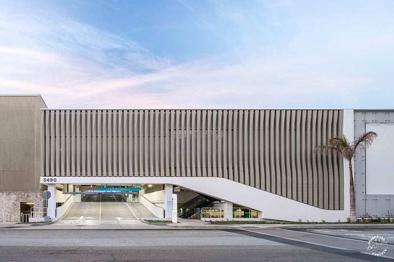
Hollywood Architecture Firm, 5+Design, Redesigns LA’s 1960s Del Amo FashionCenter
由专筑网Ann,刘庆新编译
好莱坞建筑事务所5+design对建于60年代的加州德尔阿莫购物中心进行了改造升级,打造出了艺术馆般的建筑空间,重新定义了220万平方英尺的时尚中心。
Hollywood architecture firm, 5+design, redesigns LA’s 1960s Del Amo Fashion Center, applying a museum-like regard and treatment of space and definition across 2.2 million square feet.
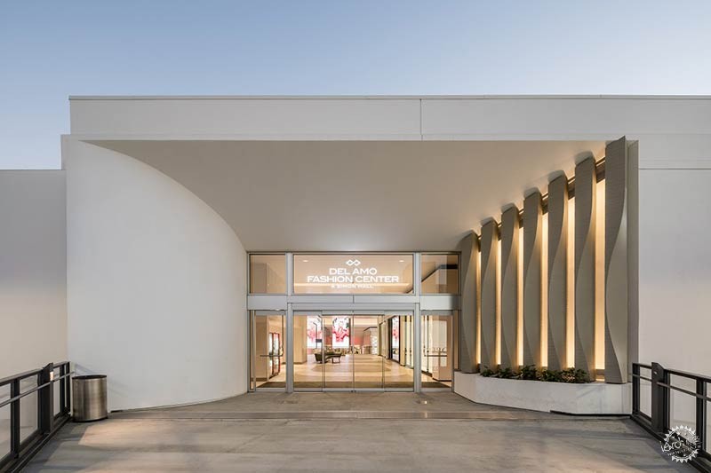
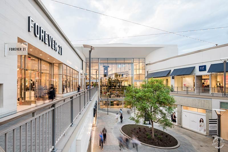
重建项目中利用光线、玻璃和立面造型打造出了与众不同的零售空间,吸引人们进入其中一探究竟。德尔阿莫购物中心采用了开放式的设计,像博物馆的画廊一样,突出了零售店面的展示空间,打造出受欢迎的公共区域。
The reimagined project uses light, glass and elevation to create distinctive, responsive retail spaces that invite exploration. Like a museum’s galleries, Del Amo’s open design highlights the display character of retail in expansive storefronts and creates a welcoming public realm.

“我们希望用曲线和弧形起到柔化空间的效果,每部分墙体和天花板都是舒缓的,像经过海浪的洗礼,不再棱角分明。我们分析了空间的表面该如何衔接,如何转折,如何过渡到角落的位置,哪里应该更加平缓微妙,哪里应该更加明显突出,我们花费大量时间研究这些空间细节。艺术馆和零售店的空间处理很相似,展示功能空间如出一辙,我们采用这种思路来探索画廊空间布局,并借此提升零售空间品质。”
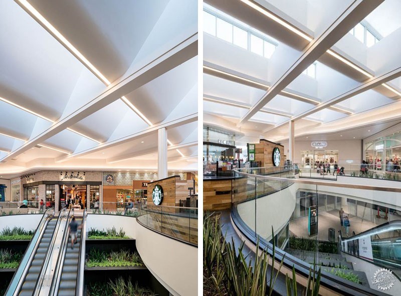
新的设计注重以人为本,以理论和隐喻的处理手法加强与周边环境的联系。室内设计了美食内街和露天的阶梯式绿化、玻璃屋顶和椭圆形的天窗,模糊了传统的室内外街景的认知。
“We tried to soften everything with curves and arcs. Every portion of the walls and ceilings are soft, like the ocean has poured over them for years and has softened all their edges. We analyzed how one surface would end and meet the next, how then that surface turns and meets the corner, where the surface should be subtler, where it should be more pronounced, and we spent a lot of time on those details. Museums and retail are more similar than separate, retail functions much in the same way. We tried to take this exploration into gallery layout and use it as a way to elevate the often substandard retail typology.”
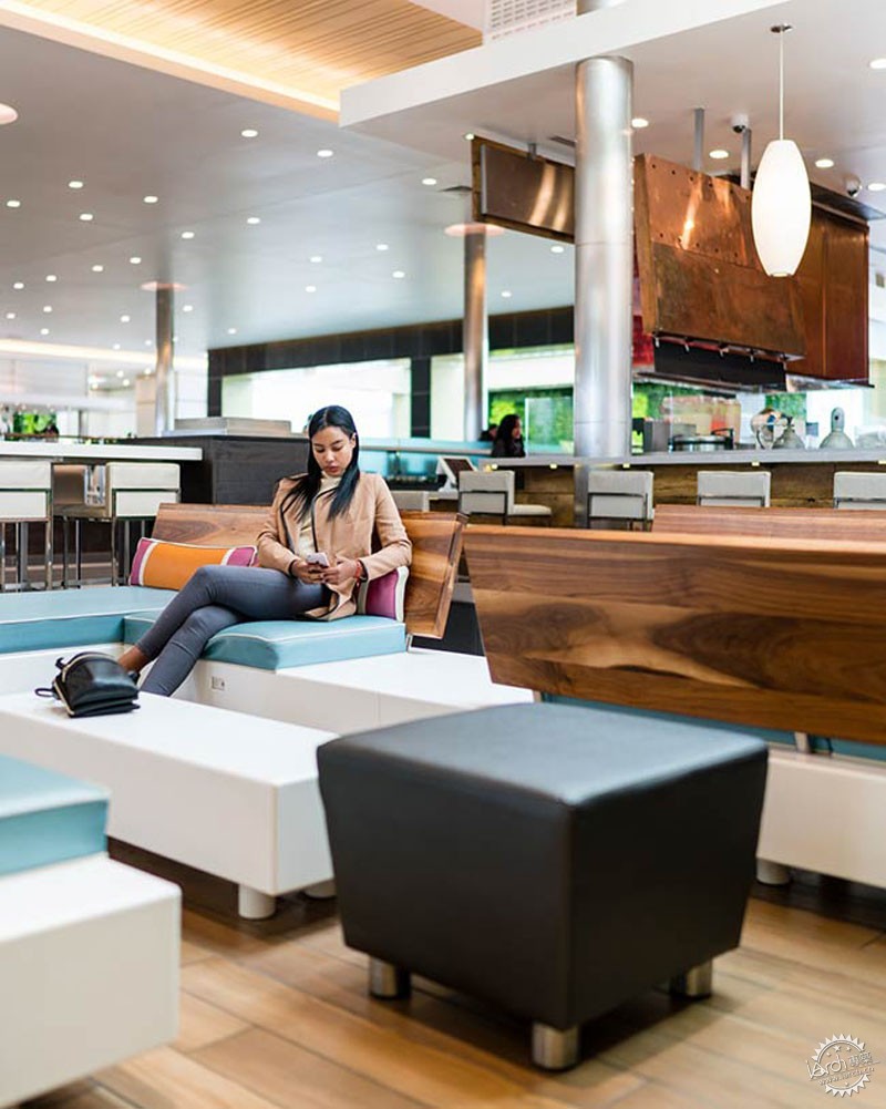
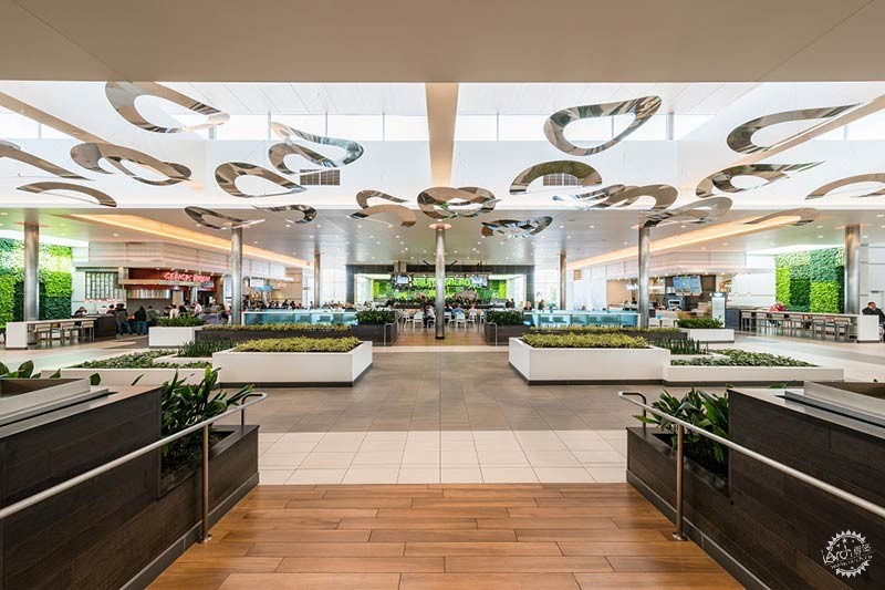
The new design is human centered, reinforcing the notion of connection to the surrounding area both literally and metaphorically. A living wall infuses the food court with planted foliage while open-air terraces, glass-topped atriums and rotund oculi challenge the perception of what is inside and what remains outdoors.

设计分为三个阶段,首先为美食广场的改造,将该区域置于横跨卡森大道的零售空间中;最大的工程阶段,即第二阶段,将现有的大型商场区域移至北向,取而代之的是两层的零售大厅和三层的阶梯式座椅。第二阶段的设计还包括了一个新的停车场。第三阶段将近一步优化设计,对邻近西尔斯的购物中心最南端进行细化,确保整个设计的完整和凝聚力。
Designed in three phases, the renovation began with a complete redesign of the food court, which was relocated to the retail bridge that spans above Carson Boulevard. The largest of the phases, phase 2, entailed a massive demolition of the existing one story mall to the north, which was then replaced by a two story retail concourse that increases to three levels at the terrace seating. Phase two also included a new parking garage. Phase 3 will consist of further refinements to the existing southernmost mall that houses Sears to ensure cohesion throughout the phases.
商场中央是宽敞的大厅,这一区域充分整合了三部分的设计,第一部分的改造的单层空间,第二部分新建的二层空间和现有的二层户外lifestyle区域。
中央大厅充分利用了位置优势,宽敞明亮,设计了六层的座椅区。温暖的木质长椅由玻璃板和丰富多彩的可移动隔断划分开,使客人体验设计和交互的个性化空间。购物中心的绿化墙面别具一格,绿色植物与温暖的木材相互搭配,相互融合。
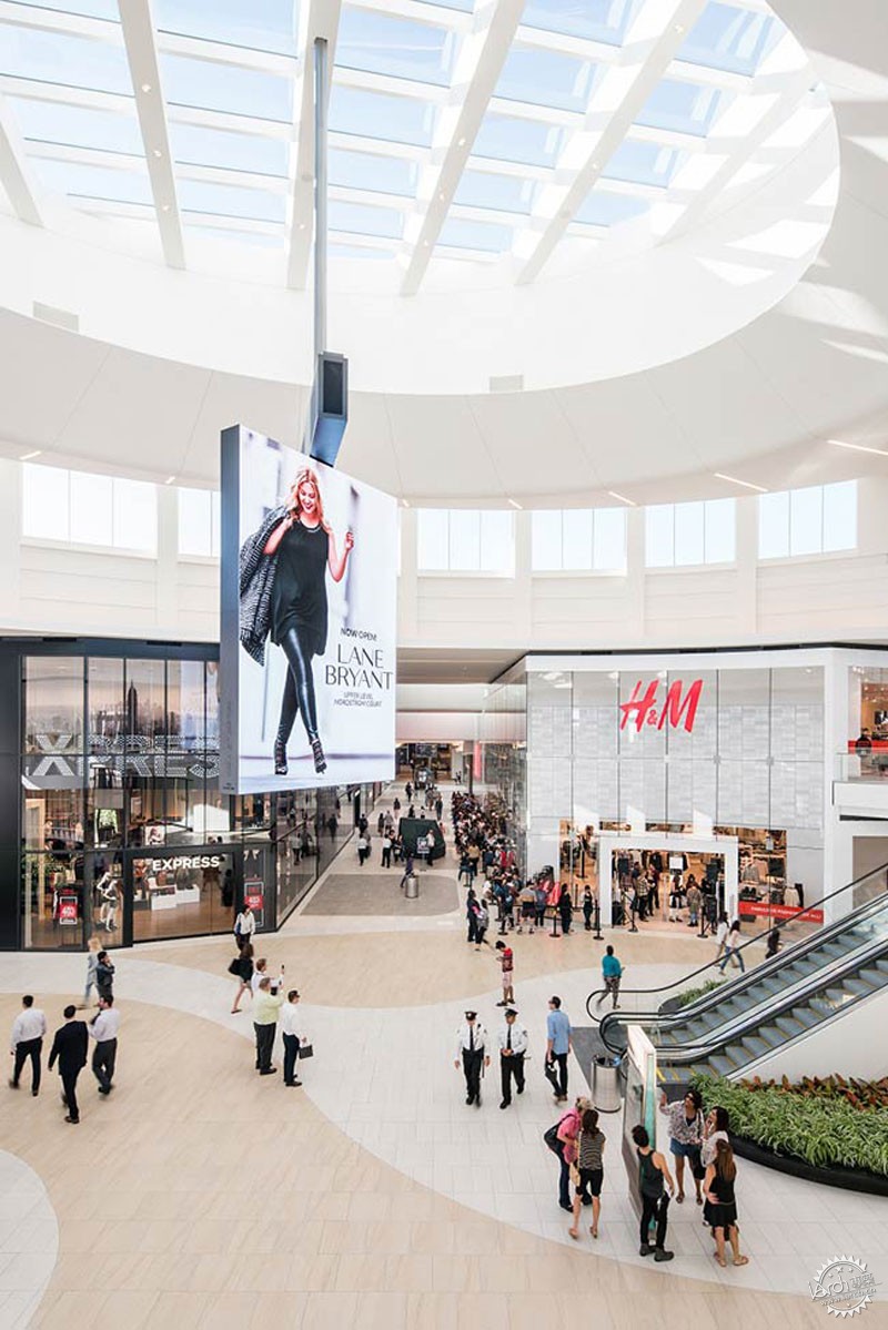
At the center of the mall sits the Grand Court. It is the zone of convergence between the project’s three main components- the single-level phase 1 remodel, the phase 2 two-story new construction, and the existing two-story outdoor lifestyle village.
Taking advantage of its central location, the Grand Court is the site of an expansive, six tiered terraced seating area. Warm wooden benches sectioned off by glass panels and colorful, movable furniture allow guests to interact with the design and personalize the space. The project’s most distinct living wall hangs adjacent, interjecting greenery that coalesces with the warmth from the wooden.
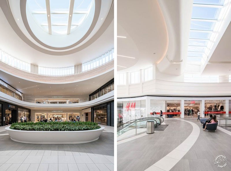
整个中央大厅设计了三层的玻璃墙,俯瞰着外部的lifestyle区,顶部是一个巨大的天窗,设置了可旋转式的屏幕。为了营造沙滩效果,大厅内铺设了深褐色和浅米色的地板并延伸至二层空间。
改造后的购物中心与之前大不相同,新的设计加入了明快的软硬景观元素、色彩多变的室内外空间,复杂的地板图案层映射着下面的光,照亮店面,并且与白色墙壁和曲线形的天花板形成对比。
新的德尔阿莫购物中心呈现出空间的统一性,彰显出优雅的魅力,空间内部的凝聚力与周边景观相互呼应。
The entire Grand Court area faces a three-story glass window box overlooking the outdoor lifestyle village and rests beneath an immense skylight that supports a rotating video screen. Envisioned to portray sand, the Grand Court’s collection of tan and beige floors meet sleek glass storefronts that reach two-stories.
A far cry from its former, the new design mixes soft and hardscape elements with airy, iridescent forms to blend the indoor and outdoor world. Intricately patterned floors reflect the light below, illuminating storefronts and contrasting with the white from walls and curved ceilings.
In its new form, the Del Amo Fashion Center presents a unified space that typifies elegant gallery-like design whose cohesion echoes from the inside out.

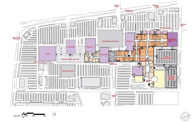
Plan /平面图
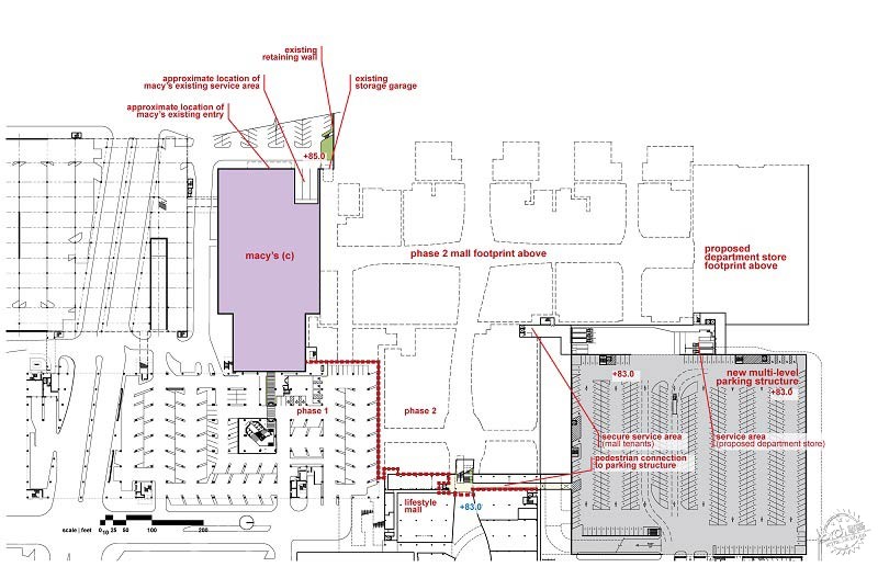
Lower plan/底层平面图
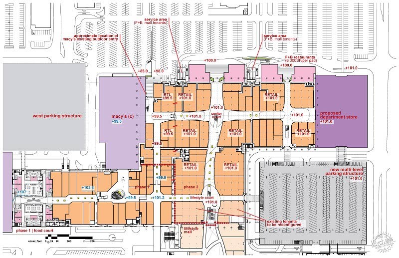
Main level/标准层平面图
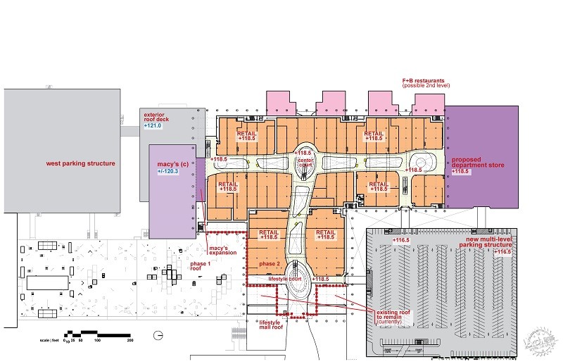
Upper floor plan/上层平面图
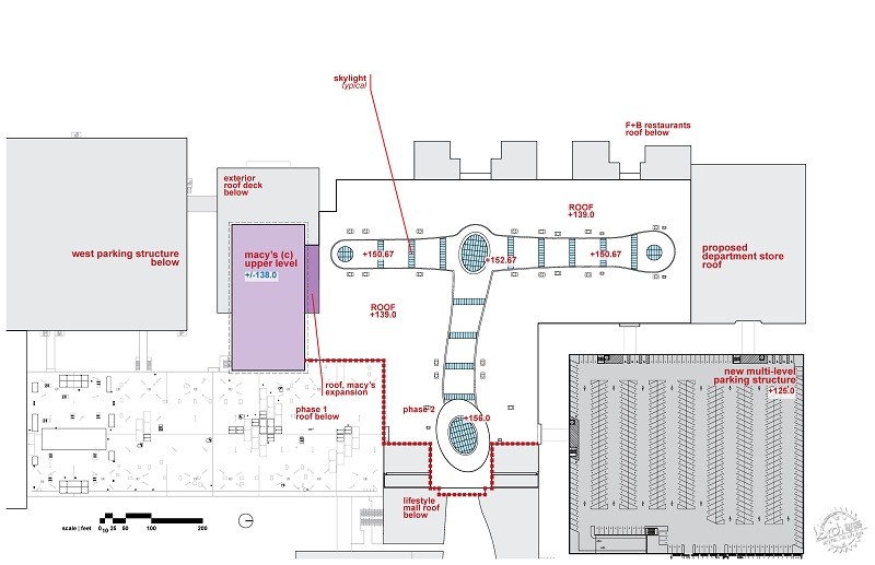
Roof plan/屋顶平面图
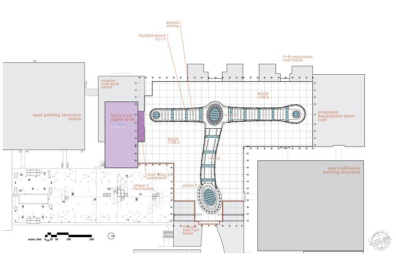
Upper floor plan/上层平面图
项目介绍:
位置:美国加州托兰斯
建筑面积:220万平方英尺
基地面积:120英亩
委托人:西蒙地产集团
建筑设计:5+design
Project Details:
Location: Torrance, CA, USA
Building Area: 2.2 million sq ft
Site Area: 120 acres
Client: Simon Property Group
Architect: 5+design
出处:本文译自architecturelab.net/,转载请注明出处。
|
|
