建筑师:Estudio Entresitio
地点:西班牙 马德里
负责建筑师: Maria Hurtado, Cesar Jimenez, Jose Maria Hurtado
设计团队:Jorge Martinez, Laura Frutos, Vincent Rodriguez, Fabrice Quemeneur, Filipe Minderico, Clara Rodríguez, Marco Plazzogna, Miguel Crespo, Alvar Ruiz
客户:Ayuntamiento de Madrid
面积:5430.82平方米
年份:2010
摄影:Roland Halbe, Raul Belinchon
你还记得从20世纪90年代开始,比尔•默里的电影被称为“土拨鼠日”吗?在电影中,每一天都是同样的,它从早晨七点重新开始,一遍又一遍的重复着。严重的是,它有时变得疯狂,但是最有益的是,它有建立三倍的精确平面图的机会。
这一切都始于一个不寻常的竞争,这是个两个中心对同一个客户的竞争(马德里市议会),他们具有相同的预算和相同功能程序,但是只是两个不同的地点。在这两种情况下,这两个地点都处在一种非常不相关的环境中,它的周围围绕着一些隐名的社会房屋。
我们对那些初始条件的答案是工程师是伴着“无人知晓的建筑”这样的理念工作的。一种强烈的正式的、职能的、概念性的自主感允许建筑坐落在任何地方。
为了强调内部的空间价值,我们诉诸LeCorbusierian的“对立的调解”的理念。外部的密封和沉重的图像存在于内部空间的开口和光线之前。
医疗保健中心的方案广泛的实施在一个单一的地下。方案中不同的房间规划在一个松散的不规则的正交网格中,在这里,十三个庭院被安排在一个锯齿形图案中,它处在沿着三个平行(非)走廊的公共和私人客房之间。
在室内和庭院之间,它提供了一种空间扩大的感觉,因此有了一种不间断的视觉连续性的效果。不考虑这种灯光系统,并且与庭院分开来看,它的坚实和厚重的外观被看做是一个连续的没有窗户的物体。
外部垂直围墙的凹陷的缺乏导致建筑物的内部和外部之间的关系发生垂直,几乎与上面的天空一起。玻璃的嵌板不是定义为庭院,但是建筑外壳中水平外观上的凹陷,创建了一种垂直关系,它允许产生一个等向的内部空间。玻璃的透明度和镜像特征创造了多个反射对称的景观。
走廊消失了,它不再存在着传统的线性连接结构,因为空余的空间和公共空间是交替排列的,它允许在“x”和“y”坐标空间中存在着一种微弱的关系。
圣布拉斯的中心是第一个建造完成的。沉重的想法是由混凝土模板的水平木板形成的粗糙的质感而加强的。对比来看,鱼鳞图案的蓝色瓷砖铺设在垂直的墙壁上,它的反射能力有助于创造一个宽敞明亮的室内环境,几乎就好像是人们把天空带到大楼中一样。
接下来是乌塞拉的中心,它完成了像混凝土、玻璃和瓷砖这些材料不得不提供身份搜索这样的工作机会。但是沿途出现了些问题,建筑公司和一个改变公司是必要的。
在建设过程中,金色的金属外层是向积极方向发展的战略需要,同时,它也是把瓷砖的颜色改变为白色的原因。最后,它是一个和圣布拉斯相比,在内部空间中存在着更多的横向和抽象的建筑。
第三行的比利亚韦德中心是在另一场比赛中获胜的建筑,其中,运气起到了很重要的作用。这个地方面积更小,有较强的城市性质,但是我们已经适应了的平面图是完美的,因此客户决定让我们再一次成为获奖者。
一些原来项目中的旧理念再一次显现出来;倘若我们缩小对立面之间的距离,用一个较明亮的建筑系统来建造相同的空间方案。通过使用由不透明但是抛光、透明或半透明的嵌板覆盖着的地质构造可以减缓外部与内部空间的疤痕。
新材料需要新的规则,结果是更大气。在使用、感知和几何体方面,孔技术已经成了一种有挑战性的调查项目;现在轮到你发表观点了。
平面图 Plan

立视图——圣布拉斯 Elevation – San Blas

立视图——圣布拉斯 Elevation – San Blas
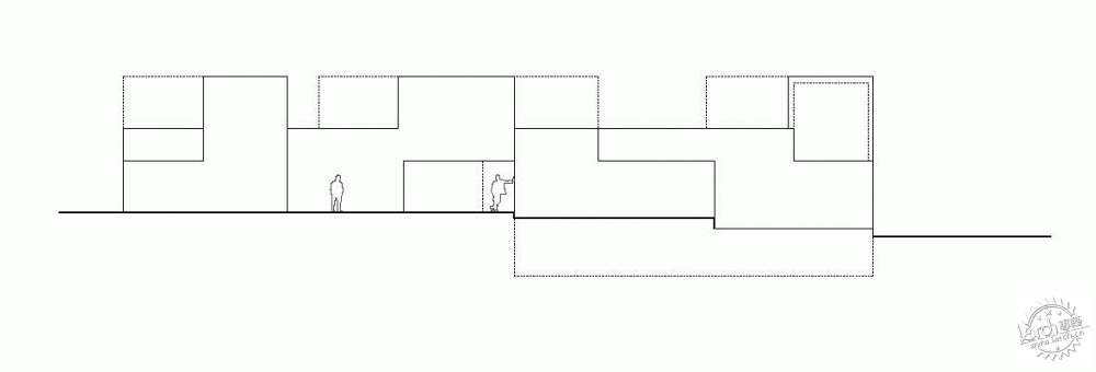
立视图——圣布拉斯 Elevation – San Blas

南部立视图——圣布拉斯 South Elevation – San Blas

南部立视图——圣布拉斯 South Elevation – San Blas
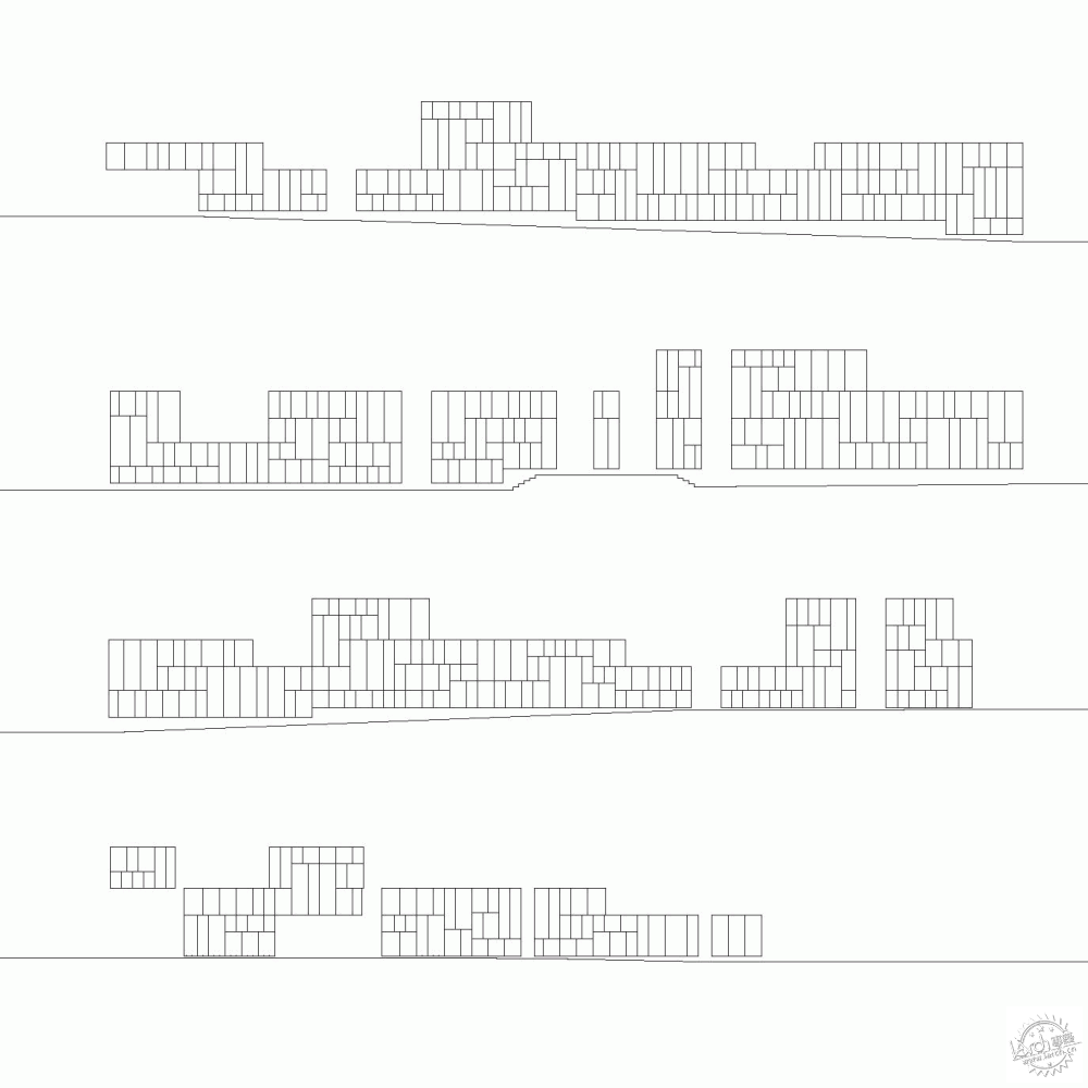
细节——乌塞拉 Detail – Usera
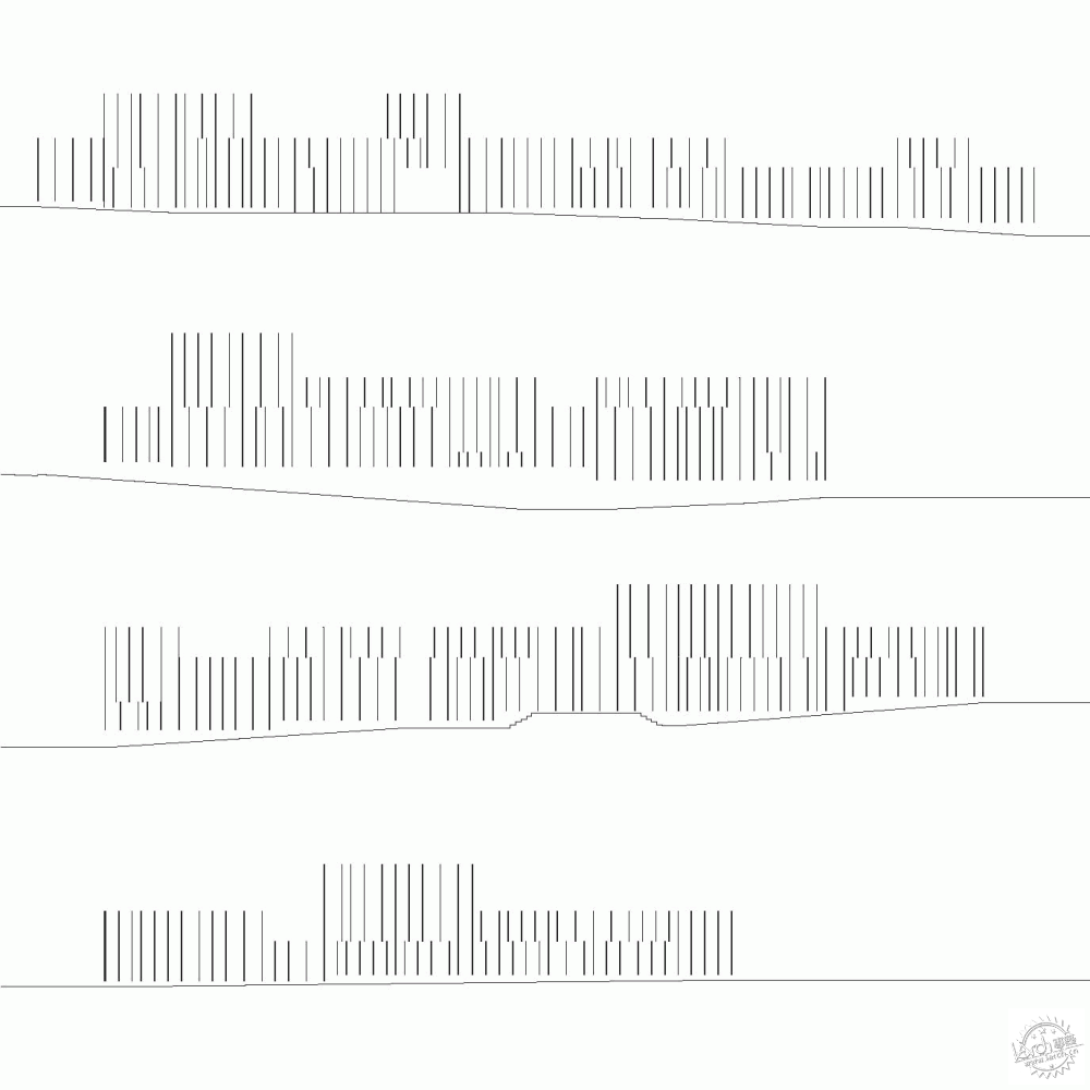
细节——乌塞拉 Detail – Usera
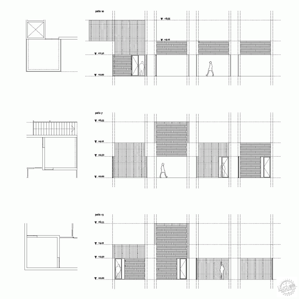
细节——圣布拉斯 Detail – San Blas
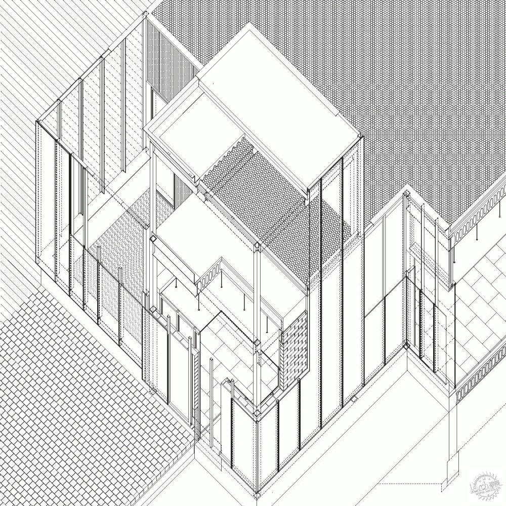
图——翠园 Diagram – Villa Verde
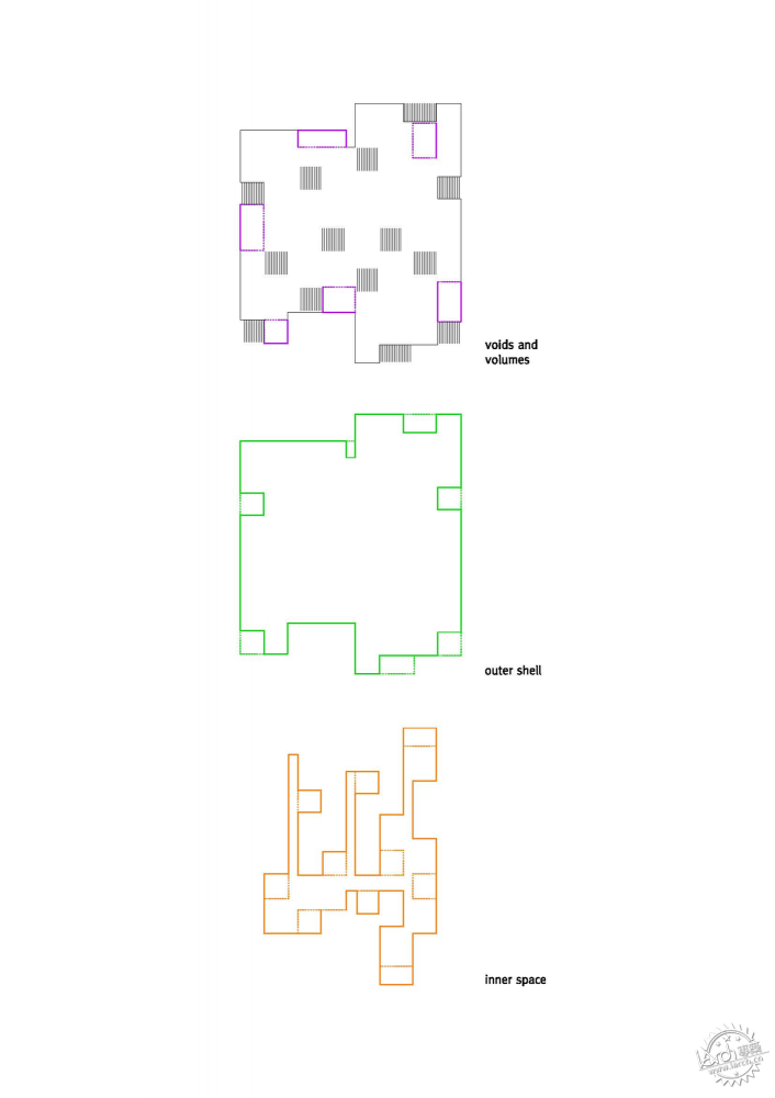
概念 Concept
特别鸣谢翻译一组4号 李鹤 提供的翻译,译稿版权归译者所有,转载请注明出处。
Architects: Estudio Entresitio
Location: Madrid, Spain
Architects In Charge: Maria Hurtado, Cesar Jimenez, Jose Maria Hurtado
Design Team: Jorge Martinez, Laura Frutos, Vincent Rodriguez, Fabrice Quemeneur, Filipe Minderico, Clara Rodríguez, Marco Plazzogna, Miguel Crespo, Alvar Ruiz
Client: Ayuntamiento de Madrid
Area: 5,430.82 sqm
Year: 2010
Photography: Roland Halbe, Raul Belinchon
Do you remember that Bill Murray’s movie from the nineties called “groundhog day”? In the film, each day was the same day and from 7am it started all over again, one time after another. Going seriously, it has been crazy at times but mostly rewarding to have the chance of building three times the exact floor plan. It all started with an unusual competition for doing two centres for the same client (Madrid’s city council), with the same budget and the same functional program but only two different sites. Sites were in both cases quite irrelevant environments with anonymous social housing surroundings.
Our answer to those initial conditions was to work with the idea of a “placeless building”. A great sense of formal+functional+conceptual autonomy was required to allow the building develop no matter where. To emphasize the spatial value of the interior, we resorted to the LeCorbusierian idea of “reconciliation of opposites”. The hermetic and heavy image of the exterior precedes the open and light space of the interior.
The program for the healthcare centre is implemented extensively on a single ground floor. The different rooms of the program are organized on a loose irregular orthogonal grid, where thirteen patios are arranged in a zigzag pattern between the public and private rooms along three parallel (non)-corridors. There is a non stop visual continuity across interiors and courtyards that provides space enlargement.
In opposition to this light system, split up by the patios, the solid and heavy façade is conceived as a continuous windowless mass. The absence of hollows in the vertical walls of the exterior enclosure causes the relationship between the interior and exterior of the building to occur vertically, almost with the sky above. The glass panels do not define patios, but hollows in the horizontal façade of the exterior shell of the building, creating a vertical relationship that allows an isotropic interior space to be generated. The transparency and mirroring qualities of the glass creates multiple visions by reflected symmetry.
The corridor vanishes, it ceases to exist as the traditional linear connecting structure, because the alternating arrangement of the empty spaces and public areas allows a weak relationship to exist between the “x” and “y” coordinates of space.
San Blas’s centre has been the first one to be built. The idea of heaviness is reinforced by the rough texture formed by the horizontal wood planks of the concrete formwork. Put into contrast, the reflective qualities of the vertical walls of blue tile laid in a fish scale pattern help to create a spacious and luminous interior, almost as if the sky were brought inside the building.
Usera’s centre follows, completing the work chances that materials such as concrete, glass and tiles had to offer in search of identity. But something along the way went wrong with the construction company and a change of company was needed. A golden metal skin is the moving forward strategy needed to accomplish a positive direction in the construction process and also the reason for changing ceramic tiles colour to white. In the end, it is possible to read interior space as a more horizontal and abstract one in comparison to San Blas.
The third of the row, Villaverde’s centre, is the result of wining another competition in which luck played a big role. The site was smaller and had a stronger urban character but the floor plan we had fitted just perfectly and the client decided to make us winners again. Some old ideas from the original project appeared again; what if we tried to build the same spatial scheme with a lighter construction system narrowing the distance between opposites. It was possible to soften the scar between exterior and interior by using a tectonic structure covered with panels, opaque but polished, translucent or transparent. New materials needed new rules and the result is more atmospheric. The hole process has been a challenging investigation between use, sensation and geometry; it is now your turn to make an opinion.
|
|
