地点:西班牙,马德里
负责建筑师:María Hurtado, César Jiménez, José María Hurtado
设计团队:Carolina Leveroni, Stefan Vogt, Jorge Martínez, Laura Frutos, Pablo Sacristán, Filipe Minderico, Anne-Dorothée Herbort, Irene de la Cruz, Miguel Crespo, Alvar Ruiz
结构:CYPE Ingenieros Estudios y Proyectos, S.A.
面积:15,450平方米
摄影:Roland Halbe, Montserrat Zamorano
这个项目是马德里房产局在2003年底展开的一个竞赛,竞赛的理念要求每个参赛队伍要遵守“经济”要素设想如何使得立面建造和住宅数目最大化,并且要认识到这是一种社会住宅的发展。参赛者的选择决定了这个方案是否解决平面所占区域的其他城市规划,走向以及高度的问题。我们的方案提供了一个为了未来规划变化的提案,我们的中选方案是一个22层的塔楼。
这个方案可以有很多种解释,有一种是我们十分想强调的,就是平面的效率和解决了例如住房这样的功能性项目。我们将这些“出租”的公寓设计成最小的规模,这些提供庇护的场所满足了最小的尺寸规定。
这个项目总共有132个双人或是单人住房单元,楼层净面积是9000平方米加上300平面米的地下商业用地。. 地上的部分,建筑的外边线包含的建筑面积站了总场地的70%,并且在前面的人行道入口进行了建筑退让,自然缓解地下商业的使用。这种退让避免了地域规划中典型的倒角以及锋利的几何形态。
对于这样一个建筑平面,减少了平面的占地必将带来高度上的增加,在这种情况下我们提出了一种罕见的形状体积比例。有人也许认为这个建筑是一个塔和中央部分的聚集,但是我们更感兴趣的是高度上的自由增加,使得各个部分去的平衡并且在一定程度上有一种不安的感觉。
这个平面的方案是以几何“双对称”为基础的,将其作为一种变形的模板,当视野旋转180度的时候,就可以看到这些信息。这个策略模糊了不同区域,每一个部分都不是明确的,从而联系了各个部分。并且这个建筑的实质是作为一个自由的块,没有前面与后面或者是开头与结尾的差别,仅仅是简单的回应了道路的入口和绿化带以及别的方向的纵向需求。
只有切开了这个复杂的发展,我们才开始理解这个项目的复杂性。尽管公寓包含了单人或是双人卧室,高度上的最小值是一样的,并且都是在一层上。这种连式住房作为不同功能单元的重复,是的底层向上纵向发展。这些住房并不仅仅是如同一棵大树的分支一样,而是解决了平面和剖面上交错。
这个复合式住宅包含了两个贯穿的多功能室可以通达北部和南部。通过一层可以直达这两个多功能活动室,这个建筑包含了三重功能,一层的商业和办公,以及地上各层的住宅。
确实这项目有很多解释方法,另外一个就是对于建筑城市特征的处理,对于城市建造的处理,以及确定居住建筑的性格的需要,在马德里这个地区,很多定义都没有被思考确立。
从这个意义上说,该项目有很多的意义。外壳的非分化和规模模糊性,使用了锌的水平滑动横条的重复,并在上下两个横条之间有一定的错位,同时中间包含了一些间隙去模糊各层的界限。我们提供了一个通过建筑窗户来识别的系统,这些窗户都被安置在建筑内部最好的位置。
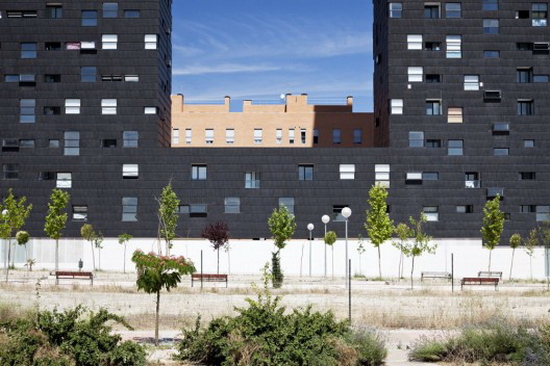
整体的支撑结构和多样性需要一些突出的板条,这种自由的扭曲,使得立面有些许变化。
“并存的尺度”和“规模的模糊”这两个概念之间的联系,与城市的历史和这么多年城市的连续发展展开了对话,什么是大,什么是小,又是什么样的因素遮盖了这些大和小。
我们混淆了日常和特别,采用常规的窗户去展现一个明确的功能需求,同时又把他们放到了特殊的位置上,移除构成帮助去理解整体建筑。
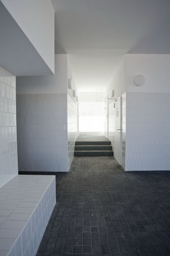
这里有第三个解释这个项目的方法“建筑和技术”,就是建造的可行性。在执行的过程中,和合法过滤建造的构成中,规划,预算,结构的可行性等等所有的一切都帮助了提出真正的空间转变这个想法。
因此,锌的表面成为了焦点并不仅仅因为物理因素,而是其提高能源效率策略。我出推出了一种低维护,帮助建筑表面散热的通风,保护建筑不受雨水的腐蚀,和防止其冷凝。这个包含了外侧墙体的声学和热绝缘的的设计,以及避免热桥在炎热的季节,会产生一种烟囱效应,在建筑中的太阳的热量通过对流上升离开建筑,使得新鲜空间从外表皮下部进入,避免了室内空间热量的积累。
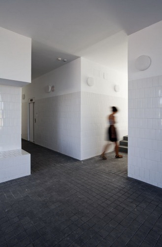
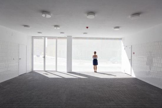
然而,在冬季,太阳辐射不足以产生空间的变动和外立面的通风,从而产生了相反效果的蓄热。
地下室平面图 Ground Floor Plan

平面 Plan

平面 Plan

平面 Plan

平面 Plan

平面 Plan
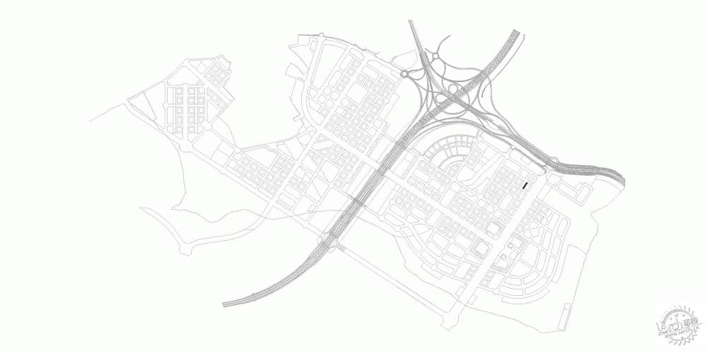
总图 Site Plan
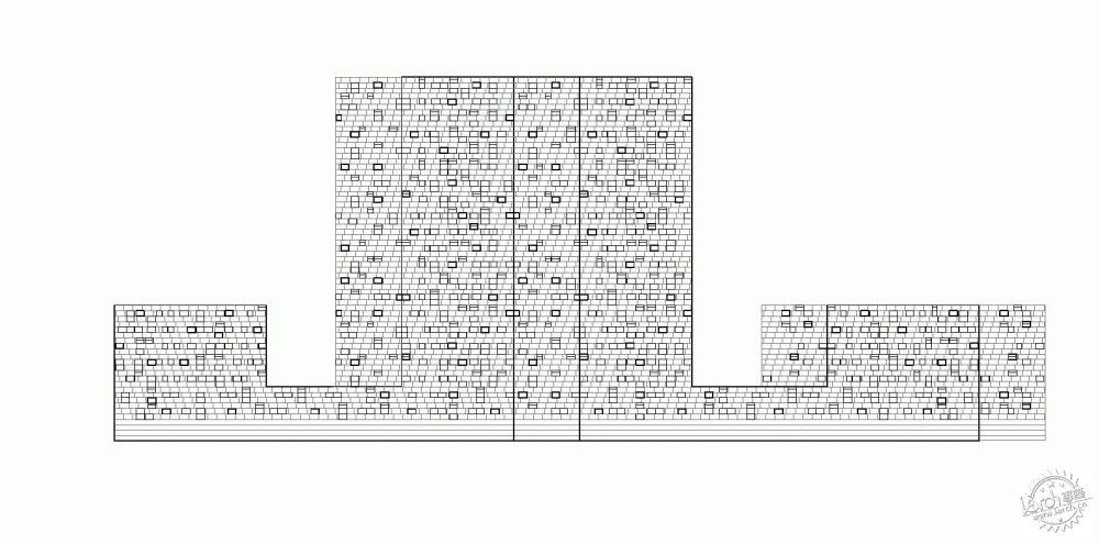
立面 Elevation

剖面 Section
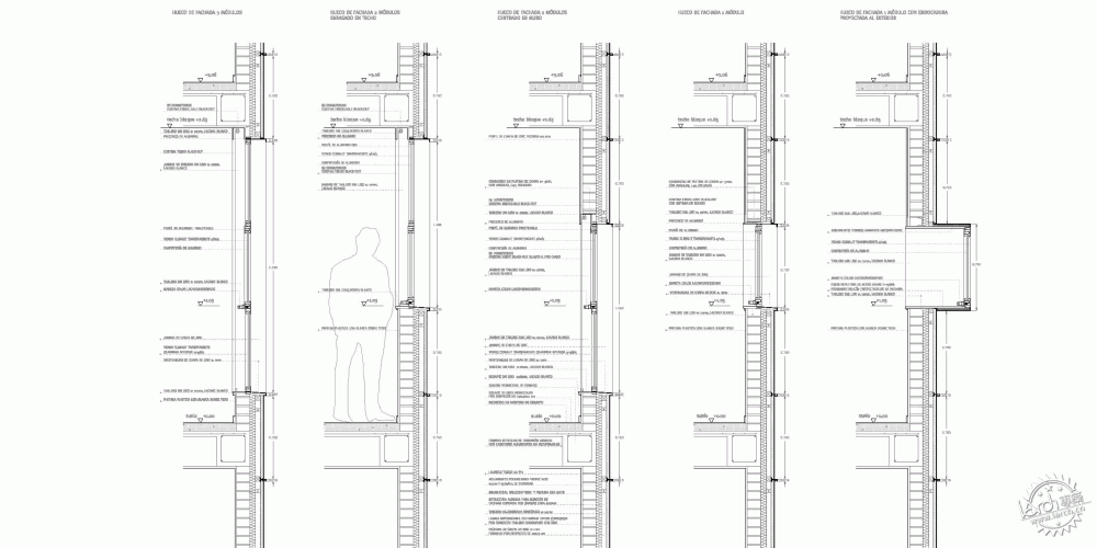
大样 Detail
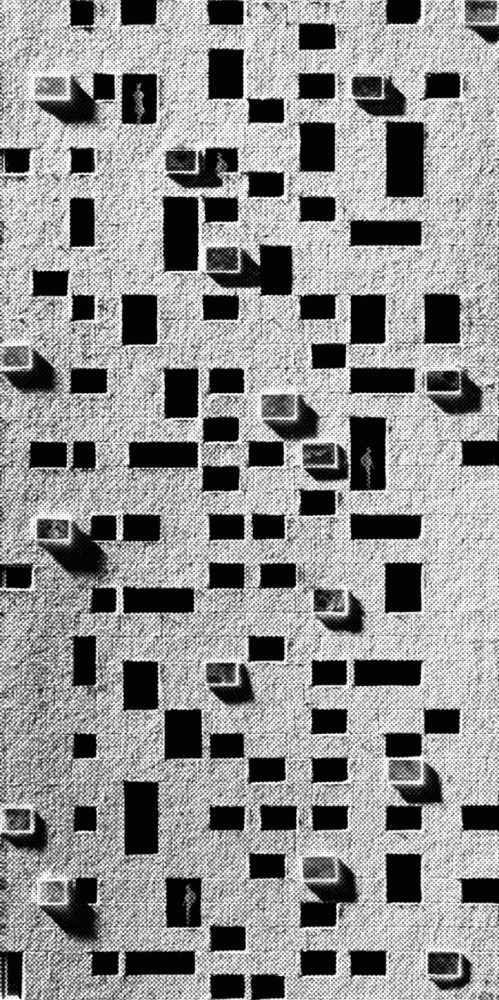
模型 Model
模型 Model
模型 Model
细节 Detail
特别鸣谢翻译一组1号zombie车夫党提供的翻译,译稿版权归译者所有,转载请注明出处。
Roland HalbeArchitects: Estudio Entresitio
Location: Madrid, Spain
Architects In Charge: María Hurtado, César Jiménez, José María Hurtado
Design Team: Carolina Leveroni, Stefan Vogt, Jorge Martínez, Laura Frutos, Pablo Sacristán, Filipe Minderico, Anne-Dorothée Herbort, Irene de la Cruz, Miguel Crespo, Alvar Ruiz
Structure: CYPE Ingenieros Estudios y Proyectos, S.A.
Area: 15,450 sqm
Year: 2009
Photography: Roland Halbe, Montserrat Zamorano
This project is the result of a competition run by Madrid’s Municipal Housing Agency at the end of 2003. The philosophy of the competition was that each team would offer the best architecture solution that was able to imagine, subject to compliance with the “economic” parameters for the lot; maximum surface to be built and number of dwellings, and always considering that it is a social housing development.
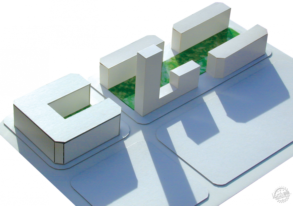
It was the choice of the contestants to decide whether a “measured” solution that would meet the other urban planning conditions of floor occupation, alignments, heights, etc.., or if, as was our case, raised a proposal that needed further planning changes. Our winning proposal was a tower of 22 floors.
The project can be explained in many ways, but there is one to which we do not like to resign, that has to do with the floor plan’s efficiency and the resolution of a given functional program such as housing. We deal with apartments “for rent” that are characterized by their small size, as they are, from sheltered housing, those most in line with the minimum dimensional regulations.
The project builds a total of 132 one and two bedrooms housing units, for a net floor area of 9000 sqm plus 300 sqm of ground floor commercial use
Above ground, the building occupies 70% of the limit set by the alignment of the façades, with a general setback to liberate more public space on the front sidewalk access and natural relief of ground floor commercial use. This setback can avoid the typical chamfers of the area planning and work with sharper volume geometry.
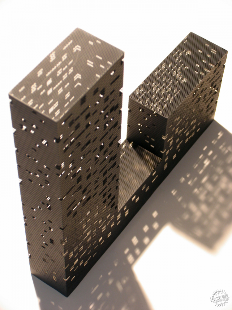
For a certain floor area, reducing the footprint of the building necessarily implies growing in height and in this case we propose a shaped volume with a profile proportions, lets say, uncommon. One might think of the building as an aggregation of a tower and a block by a central body, but we are more interested in the idea of a free development in height, where the balance between the parts and the whole is somewhat disturbing.
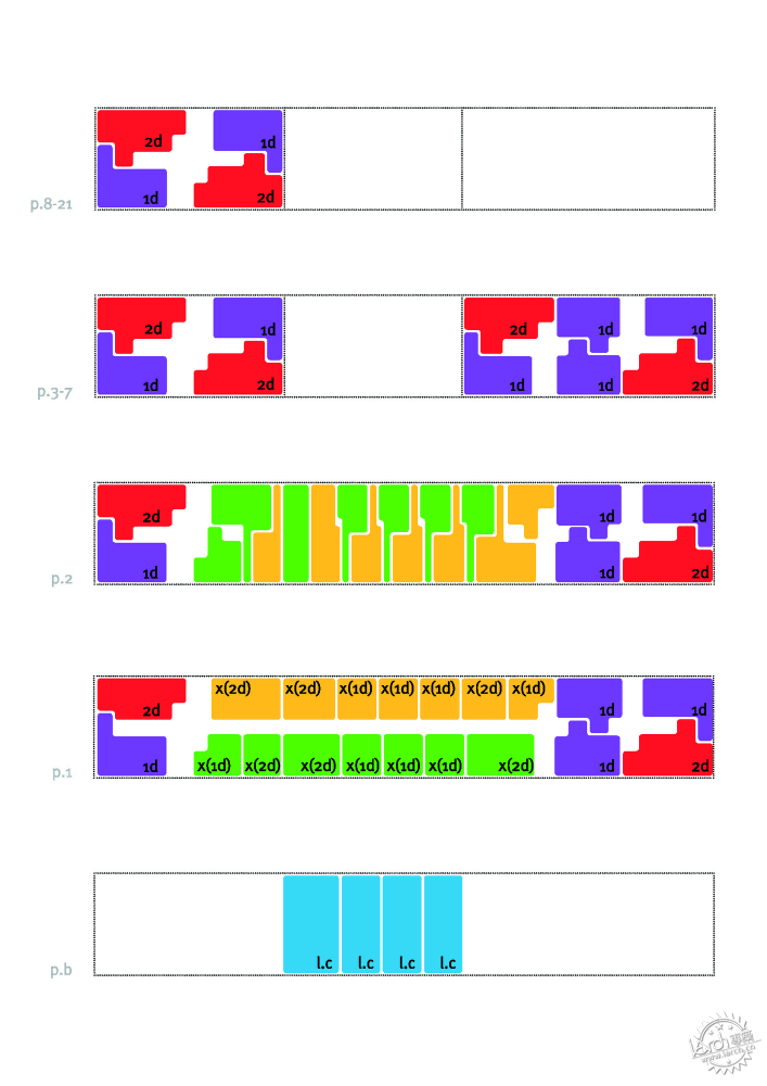
The floor plan solution is based on the geometric process of “double symmetry”, as in the ambigrams, which are words or figures that can be read alike when rotated 180 degrees. This strategy works to blur the different parts as the order of each one is not clear and becomes associated with the order of the others. It also has to do with the fact that the building, as a free block, is perceived as a piece in which there is no distinction between front and rear or beginning and end, and responds similarly to both the access road as to the green zone that runs lengthwise on the other front.
Only in a clinical cut of this mixed development, we would begin to understand how diversity has ordered the program. Although all the apartments have 1 or 2 bedrooms, the smallest elements are set in height, and developed on one floor, while the duplex, as repetition of functionally undifferentiated units, occupy the longitudinal development of the plinth. The homes are not the result of an a priori subdivision of the plant but are solved interlaced both in plan and section.
The duplex units are composed of two versatile rooms that cross section to enjoy both North and South directions. By having access by the first floor can respond to both, the characteristic use (planning) of housing or to tertiary application, commercial and offices at the first floor and hosting at any level above ground floor.
As indeed there are many ways of explaining a project, there is another one that deals with the urban character of the building, with the construction of the city and the need to, somehow, characterize new residential tissues, in this case of Madrid, that as many others lack of intention in its definition.
In this sense the project works on several levels. The outer shell uses resources of non-differentiation and scale ambiguity. It is a skin of zinc scales set in horizontal bands that slide one over another with a slight offset, and in which voids are inserted with the intention of not making clear the floor levels. We propose a combinatorial system of recognizable types of housing windows which are placed at the best position from the inside of the rooms.
On this support structure of unity and also of diversity, are added some projecting crates, that as free forms of distortion, introduce a slight vibration on the elevation.
In this way we mix day-to-day and extraordinary, the regular domestic window that corresponds to a clear functional order with extraordinary placements, removing the composition and helping to understand the whole as a uniform mass.
There is also a third way of explaining the project that could be the titled as “architecture and technique”, which deals with the fitting of ideas to make them buildable. In developing the execution project and during the construction process occurs filtering of legislation, planning, budgeting, constructive feasibility and, above all, the real spatial translation of the topics raised.
Thus, the zinc facade becomes the central argument not only for its physical implementation, but also as an energy efficiency strategy. We propose a low maintenance solution, ventilated, which facilitates the transpiration of the facade, protects the building from rainwater infiltration and prevents interstitial condensation. It involves the optimization of acoustic and thermal insulation of the building, which being located on the outside of the brick walls, avoids possible thermal bridges.
In the hot season, it produces a “chimney effect”, the sun heats the air standing in the chamber, rising by convection and forcing fresh air to enter on the lower part of the façade, preventing the accumulation of heat in the inter layer space.
In winter, however, solar radiation is not sufficient to produce the movements of air and ventilated facade acts as a heat accumulator to produce the opposite effect.
|
|
