建筑师:HPP Architets
地点:德国,杜塞尔多夫
设计团队:Myriam Hamdi, Stephan Heimann, Barbel Walger, Wolfgang Miazgowski, Anja Biechele
面积:19,950平方米
年份:2012
摄影:Ralph Richter, Jens Kirchner
Architects: HPP Architets
Location: Dusseldorf, Germany
Design Team: Myriam Hamdi, Stephan Heimann, Barbel Walger, Wolfgang Miazgowski, Anja Biechele
Area: 19,950 sqm
Year: 2012
Photographs: Ralph Richter, Jens Kirchner
室内工程师:Silvia Pappa工作团队 / UKW Innenarchitekten
结构工程师:Bollinger + Grohmann Ingenieure, Frankfurt a. M.
技术工程师:Winter Ingenieure, Dusseldorf
隔音:Peutz Consult
景观:W. Prechler, Dusseldorf
照明:AG Licht, Bonn
Interior: Working Group Silvia Pappa / UKW Innenarchitekten
Structural: Bollinger + Grohmann Ingenieure, Frankfurt a. M.
Technical Engineer: Winter Ingenieure, Dusseldorf
Acoustic: Peutz Consult
Landscape: W. Prechler, Dusseldorf
Lighting: AG Licht, Bonn

这是创新教学与学习和发展的交流场所。尽管绿洲(Oasis)这个名字主要是措辞的选用,这个名字确实唤起了人们的渴望。位于杜塞尔多夫的海涅大学和医学院新的图书馆与沙漠中的沃土确有异曲同工之妙。这不在于其建筑形式,更在于其建筑理念,该项目旨在设计一个可以热情学习的空间、一个交流的空间、一个创新教学与学习和发展的空间。这些建筑理念的德国首字母放在一起则构成了单词O.A.S.E.,即绿洲(oasis)。
在不到两年半的设计和施工中,我们成功地在北莱茵威斯特伐利亚(North Rhine Westphalian)的首都创造出一个具有里程碑意义的大学校园。新的医学图书馆是2030年总体规划重建城市西部14公顷的大学校园的一部分。该大学在过去的几十年里不断扩建,致使其构成了极不统一的外观。此处非常需要新的标示点;例如一个创新教学和学习的灯塔项目。
A place of Exchange, of Innovative Teaching and Learning and of Development. The name evokes longing and although the name Oasis is chiefly a play on words, the architecture of the new medical library of the Heinrich Heine University and the University Clinic in Dusseldorf demonstrates clear similarities with a fertile spot in the desert. Not through its form but through its concept; the brief was to design a space for enthusiastic learning; a place of exchange, of innovative teaching and learning and of development. The initial letters of these concepts in German together form the word O.A.S.E. – oasis.
In less than two and a half years of design and construction we managed to create a landmark on the campus of university in the North Rhine Westphalian capital. The new medical library is part of the 2030 Master Plan to reorganise the 14 hectare university campus in the Wersten district of the city. Constant expansion of the university over the past few decades led to an extremely heterogeneous appearance. New identification points are required; a lighthouse project for innovative teaching and learning, for example.

绿洲就是一个吸引点;从很远的距离就可见,高38米多,有非同寻常的外观结构和闪闪发光的白色外表。在其单调的灰色环境中脱颖而出。其固体结构的外观反映了图书馆的专业主题; 也是毛细管系统的建筑表达。这个想法进一步体现于其光滑、白色的外观。有机形的玻璃马赛克瓷砖通过玻璃条彼此相连,并像修长的立方体上的网络一样蔓延,从而构成了其不可置疑的外型结构。
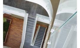
这种动态通过流动的开放式空间结构反映于室内设计中。同诸如阅读和借阅区域此类强制性的图书馆设施一起,工作和学习室、咖啡厅和宽敞的公共区和展览区位于地上的八层楼空间内。各种图书室、研究和学习室都位于楼的顶部,并可以通过一个圆柱形的电梯和楼梯达到。服务核心与文档室和卫生间位于斜对面的位置。
The Oasis is such a point of attraction; visible from a great distance, it is 38 m tall, has a very unusual façade structure and a gleaming white skin. It projects unequivocally out of its rather monotonous grey surroundings. The external appearance of the solid structure reflects the library’s specialist topic; it is the architectural expression of the capillary system. This idea is further reflected in the smooth, white façade. Organically shaped glass mosaic tiles linked by glass strips spread like a network over the slender cube and lend the structure its unmistakeable shape.
This dynamic is reflected in the interior design through the flowing open spatial structure. Along with the obligatory library facilities such as the reading and lending areas, work and study rooms, a cafeteria and generous public and exhibition areas are arranged on the eight floors above ground level. The various library, study and learning rooms are stacked on top of one another and are accessed via a cylindrical lift and staircase core. The service core is diagonally opposite as are the document lounges and the toilets.

图书馆的一楼被设计为双层楼高,且带有悬空阁楼的空间。咖啡厅、自助餐厅前台和大型演讲会议室与入口大厅直接相连,入口大厅处设有服务台和电子图书馆安全门。阁楼处可作为会议空间,并可直接通过玻璃墙看到下面咖啡厅的喧嚣。
一楼到四楼除了大小各异的学习室,还有专业医疗和牙科图书馆。学习室中的数码白板可以连接世界最先进的互动通信和数据交换。专门配备的父母-子女学习室加强了该建筑概念中的用户友好方面。每个楼层的中央区都自由地安排了学习大厅,这反应了我们意欲将使图书馆不只作为学习的地方,更是体验的地方的几何与有机形式之间简单的过渡。此外,所有的桌子都配备了WLAN和电源插座,其中一半还配备了固定的LAN插座。
The ground floor of the library has been designed as a double-height space with a suspended mezzanine floor. The cafe, the cafeteria counter and the large lecturetheatre are directly connected to the entrance foyer that houses the information desk and the electronic library security gate. The mezzanine offers a conference space with a direct view onto the hustle and bustle of the café below through a glass wall.
The specialist medical and dental library rooms along with study rooms of various sizes are organised on levels 1 to 4. Digital whiteboards in the study rooms permit the most up-to-date interactive communication and data exchange. A specially fitted out parent-child study room is reinforces the user-friendly aspects of the concept. Learning lounges are arranged freely in the central zones of each floor reflecting the easy transition between geometric and organic forms in keeping with our intention to make this a library to be experienced and not just used. All desks are equipped with WLAN and power sockets and half of these are additionally fitted with fixed LAN sockets.

该图书馆的核心位于四楼- 借阅办公桌 - 我们采用带有自动分类还书的还书系统,实现了大学对于技术问题的要求。在这层楼还有电子学习室,共30个电脑桌,另有一个小食堂和图书馆工作人员的办公室。而较低的楼层则只能通过楼梯和电梯到达,开放的内部楼梯可通往楼上的图书楼层,那里书架与开放式阅读和工作区以及独立小组研讨室交替安置。为了与整体建筑理念保持一致,该建筑越向上运行,越安静,氛围也越利于集中工作。
The centre piece of the library is on the fourth floor – the borrowing desk – we fulfilled the University’s request for a state of the art issue and return system with automatic sorting of returned books. Also on this floor are an e-learning room with 30 computer desks, another small cafeteria and offices for library staff. Whereas the lower floors are only accessible via the staircase and lifts, open internal stairways lead to the upper library floors where the bookshelves are laid out alternating with open-plan reading and working areas and separate group study rooms. In keeping with the concept as a whole, the areas become quieter and quieter as one moves upwards through the building and the atmosphere becomes ever more conducive to concentrated working.

七楼就像一楼一样是一个带有悬空阁楼的双层楼高的楼层,供进一步个人学习使用。绿洲的最顶层是屋顶露台,在此,学生可以清晰地观赏整个大学校园。地下室设有特殊功能,包括衣帽间和底层展览区的洗手间。
Level 7 is, like the ground floor, a double-height storey with a suspended mezzanine level providing further individual study areas and chill out zones. The uppermost floor of the Oasis is a roof terrace that affords students clear views of the entire university campus. The basement has been designed to house the technical functions including the cloakrooms and toilets for the exhibition areas on the ground floor.
室内设计是与Silvia Pappa_UKW Innen architekten一起构思与实现的。装潢饰品的质量反映了该空间的建筑方面。该建筑的求容积表达,外观自由流动的形式和构造都需要室内设计有适宜的回应。
The interior design was conceived and realised together with the Silvia Pappa_UKW Innenarchitekten working group. The quality of the fittings reflects the architectural aspects of the spaces. The expressive cubature of the building, the free-flowing forms and fabric of the facade require a fitting response in the design of the interior.
Section 截面图
Section 截面图
特别鸣谢翻译一组10号 张晓丽 提供的翻译,译稿版权归译者所有,转载请注出明处 |
|

 印第安纳大学医学院/ 景隆设计事务所/Indiana University Health / Cannon Design
