Jonathan Tuckey Design Create Residential Interiors for Post-Industrial Gasholders
由专筑网邱媚,卢荣姝编译
总部在伦敦的英国建筑设计公司Jonathan Tuckey Design(JTD)为原本在伦敦国王十字区的‘储气三件式’做了一系列住宅室内设计。这个19世纪中期的结构内部设计了145个独立公寓,Wilkinson Eyre Architects对其进行了‘建筑插入’(建筑本身)。
London-based British practice Jonathan Tuckey Design (JTD) have created a series of residential interiors for the 'Gasholder Triplets' in London's formerly industrial King's Crossdistrict. 145 individual apartments have been designed inside these mid-nineteenth century structures, within which Wilkinson Eyre Architects have created the "architectural insertions" (the buildings themselves).
Sketchbook foldout/速写折本展示。Image © Jonathan Tuckey Design
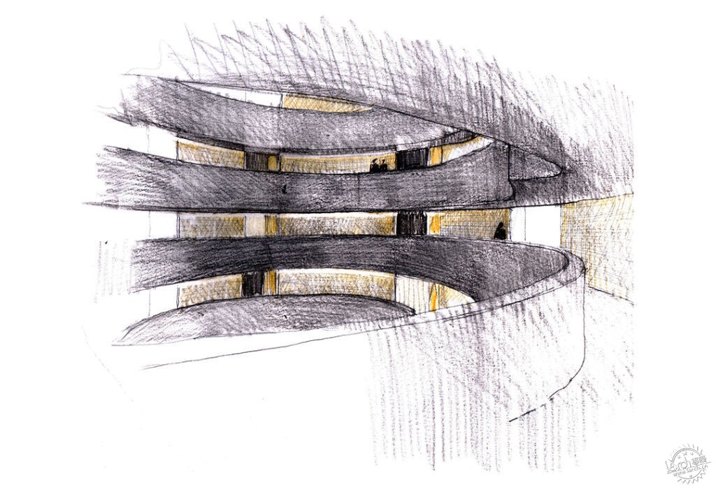
为了展现设计师门的工作,设计团队在工作室制作了手绘草图和工作模型。这与摒弃商业化和经常与发展商项目有关的细致展示有联系。阿尔金热衷这些以更传统的方式展示和回顾建筑的设计过程。以至于潜在买家来参观他们的工作室只为一览草图和模型,并感受这些未来的建筑如何成型。这些经历也促使设计师们绞尽脑汁地考虑这些汇报素材在专业设计中的角色。建筑师变得在展示作品上过于配合,甚至可能误导客户。
To present our work we have produced hand-drawn sketches and working models made by the design team at our studio. There is nothing that smacks of the commercial and slick presentation that is usually associated with developer projects. Argent have warmed to this perhaps more traditional approach to showing and reviewing the design process on their building. So much so that prospective buyers are coming to our studio to see the sketches and models and get a feel for how these future homes are taking shape. The experience has also made us think hard on the role that presentation materials play in the profession. Architects have become too corporate in the way they show their work perhaps in a misguided effort to appeal to clients.
Plan sketch/平面草图。Image © Jonathan Tuckey Design
公寓响应了‘维多利亚式铁艺造型和一个现代化高技新楼层的融合’。设计师们认为他们的角色‘是制作延续Wilkinson Eyre Architects复杂几何形状的平面设计图,建造附着在他们所建立的条条框框中的空间。’公寓的楼层平面设计图从夸张的室内天井延伸出来,从储气罐中心向外立面伸展伸,营造出非常独特的楔形形态。
The apartments respond to "the fusion of Victorian iron frames and a new layer of high-tech modernism." The designers felt that their role "was to generate plans that felt like a continuation of the intricate geometry shaped by Wilkinson Eyre Architects, creating spaces that adhered to the radii and arcs that they had established." The floor plans of the apartments expand from the dramatic interior atria, at the centres of the gasholders, outwards to the external façades creating very particular wedge-shaped forms.
Interior/Exterior sketch/室内/室外设计速写草图。Image © Jonathan Tuckey Design
落地玻璃窗和半反光松木地板的组合更加衬出公寓的高度。浇筑地面还能使楔形平面设计显得肃静,避免室内与建筑独特几何形状的激烈碰撞。设计师们采用染色橡木条板凸出起居室和卧室区的界限。
在开放式起居空间内设计师们做了一个厨房设计作为建筑内的机械性代表;他们为单元挑选了一种彻底上色的工程面板,并使用各种拉丝的不锈钢和黄铜进行装饰。设计师们在天花板采镜面板和与天花板平齐的平板型灯具,放大厨房的规模。
为了在主卧营造一种温暖舒适感,设计师们用通高的墙板对这些空间进行划分。墙板以黄铜包边,以机械打孔的金属百叶窗连接,划分每间公寓的同时也体现了黄铜的细节,在开关之间展示,由住户一手掌握。
浴室正好相反,加入了一排定制的水泥瓦砖和面板,并装饰了与之呼应的水泥浴缸。这些室内物件的坚固感从细节中完善,与厨房的流光的面板、镜子和黄铜饰件的应用效果相似;这些产生视觉感的元素增强了房间的气势。
The combination of floor-to-ceiling glazed windows and semi-reflective poured resin floors adds significantly to the sense of height within the apartments. The poured floors also help to calm the wedge-shaped floor plans, avoiding awkward collisions between the interiors and the building's distinct geometry. We have used stained oak timber panels to delineate the thresholds between the living spaces and the bedroom areas.
Within the open-plan living areas we developed a kitchen design that plays on the mechanical character of the building; we selected a type of through-coloured engineered board for the units and applied varying finishes of brushed stainless steel and brass. We used mirrored panels and flush, flat-panel light fittings in the ceilings to exaggerate the sculptural form of the kitchens.
For a warmer feel inside the master bedrooms, we lined these spaces with full height felt wall panels. These are edged with brass, connecting them with the mechanized perforated metal shutters that shade each apartment which also feature brass details, revealed as they open and close, controlled from within by the resident.
The bathrooms by contrast are lined in bespoke concrete tiles and panels and feature matching concrete washbasins. The solidity of these interiors is complimented by details similar to those found in the kitchens with their use of flush light panels, mirror and brass accents; these elements interact visually to increase the sense of scale in these rooms.

Interior sketch/室内草图。Image © Jonathan Tuckey Design
根据设计师们的描述,选用空间材料颜色的灵感来自‘在制定设计理念的时候与发展商阿尔金一起研究的大量先例。’包括Carlo Mollino设计的 Teatro Regio di Torino [1967];来自Toselli 的 Casa Torre,Arturo Carmassi 设计的Pisa [1250/1980];Ricardo Bofill设计的St Just Desvern水泥厂[1900/1970s];和土库曼斯坦的Yoloten水电站[1911]。
According to the designers, much of inspiration for the spaces' material palette come from "the many precedents we reviewed with developer Argent when working on the design concepts." These include: Teatro Regio di Torino by Carlo Mollino [1967]; Casa Torre, via Toselli, Pisa [1250/1980] by Arturo Carmassi; the Cement factory, St Just Desvern, by Ricardo Bofill [1900/1970s]; and the Hydro-electric Power station at Yoloten, Turkmenistan [1911].
Diagram sketch/示意草图。Image © Jonathan Tuckey Design
项目预定2017年完工。
The project is slated for completion in 2017.
建筑设计:Jonathan Tuckey Design
地点:英国,伦敦N1,国王十字区
负责人:Jonathan Tuckey
设计团队:Peter Youthed, Matthew Farrer, Catarina Cristovinho, Belen Salgado, Glen Tomlin, Katrin Sölter
助理:Ioannis Devaris, Laurence Hiller, Rohullah Kazemi, Ben Stewart-Smith, Helen Galletti, Aneta Szymczyk-Michalski
年份:2015年
摄影:Jonathan Tuckey Design
Architects: Jonathan Tuckey Design
Location: Kings Cross, London N1, UK
Architect in Charge: Jonathan Tuckey
Design Team: Peter Youthed, Matthew Farrer, Catarina Cristovinho, Belen Salgado, Glen Tomlin, Katrin Sölter
Assistants: Ioannis Devaris, Laurence Hiller, Rohullah Kazemi, Ben Stewart-Smith, Helen Galletti, Aneta Szymczyk-Michalski
Project Year: 2015
Photographs: Jonathan Tuckey Design
The project is slated for completion in 2017.
出处:本文译自www.archdaily.com/,转载请注明出处。
|
|
